Composition studio
1. Application description
The application presented in this document is used to create map compositions, which can then be shared with external users for data presentation or analysis.
Map Composition Studio does not require installation or configuration – it opens directly in a web browser window (and does not require installing additional plugins). Its primary function is the process of creating a map composition.
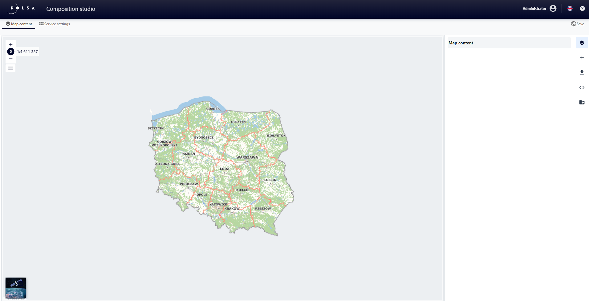
Figure 1. Map Composition Studio
The Map Composition Studio is an intuitive wizard that allows the user to prepare a map composition based on available resources and functions, as well as save and publish it.
2. Rules for navigating the application
Conventions used in the document
This chapter presents the main concepts and abbreviations used in the chapters of the document.
Table 1. Glossary of terms and abbreviations
Lp. |
Term / Abbreviation |
Explanation |
|---|---|---|
1 |
NSIS |
National Satellite Information System |
2 |
WMS |
An international standard for sharing spatial data on the Internet in raster format. |
3 |
WMTS |
An international standard for sharing spatial data on the Internet in the form of raster, predefined map fragments (so-called tiles). |
4 |
LPM – LMB |
Left mouse button |
The table below describes the application controls.
Table 2. Application Controls
Element |
Description |
|---|---|
|
Visibility on/off button |
|
Delete button (Trash) |
|
Switches (Checkbox) |
|
Parameter value change slider |
|
Invert palette button |
|
Symbol edit buttons |


3. Application control
The main device for operating the application is a computer mouse. It allows for basic map navigation, configuration of subsequent elements, and operation of application functions.
Controls are intuitive and straightforward. All functions are activated by hovering the mouse cursor over the appropriate icon and then pressing the LPM (left mouse button-LMB).
Moving around the map: the user holds down the LPM (left mouse buton-LMB), drags the map to the desired location, and then releases the button.
The user can also uses the arrow keys on keyboard.
Zooming in/out the map: The user uses the mouse wheel to scroll up or down.
Entering a value: The user highlights the appropriate field, LPM click (left mouse button-LMB), and enter the value using the keyboard.
4. Application features
This section describes the individual features of the Map Composition Studio, which are available to logged-in users.
5. Launch of the Map Composition Studio
The Map Theme Studio is launched from the Resource Manager. The user selects the Add Resource + → Service → from the drop-down list New map composition.
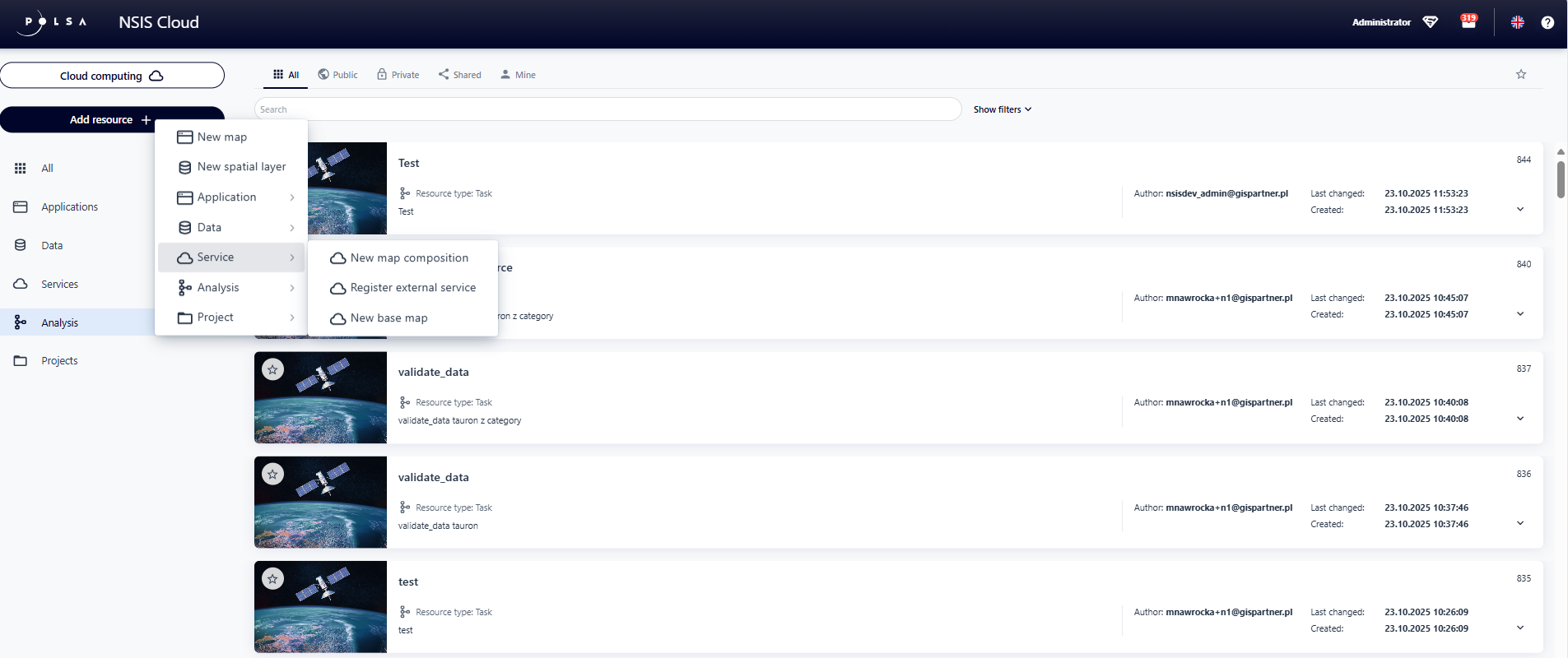
Figure 2. Launching the Map Composition Studio
6. Map Contents
In the “Map Contents” tab, the user selects the data that will be included in the composition from a list.
A map is selected by LMB -click (left mouse button-LMB) on its name. The selected map is marked in color.
The user can select multiple background maps.
Add data
To add a new resource – data, the user selects the “Add Data” button.
A window appears, allowing to search for data and add it to the application.
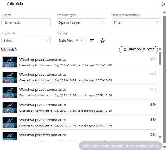
Figure 3. Map Contents - Add Data
The user can select a resource directly from the list or search for it using the available filters:
Searching for a resource by name,
Filtering by resource type selected from the list,
Filtering by availability of a resource selected from the list,
Filtering by keywords of a resource selected from the list,
Filtering by resource characteristics (name, ID, creation date, modification date),
Sorting resources in ascending or descending order,
Filtering resources marked as favorites.
The user selects a resource by clicking LPM (left mouse button-LMB) on its name and then the Select and go to configuration button.
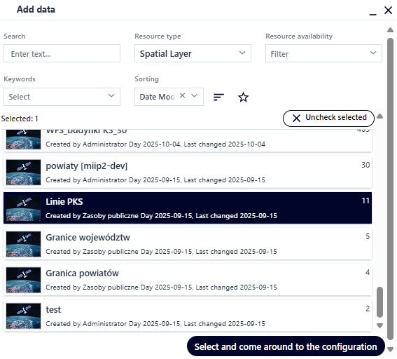
Figure 4. Add data - Data Selection
The specified resource is added to the application. The user can add more than one data resource at a time.
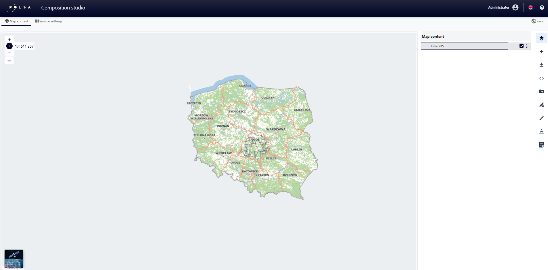
Figure 5. User data - Added Data
The “Menu” button next to the layer provides a context menu with the Duplicate and Delete options.
The duplicate layer has the same configuration parameters as the source layer.
Add Group
The user selects the Add Group button. The tool widget is displayed.
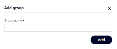
Figure 6. User Data – Add Group
The user enters a name for the group and selects the Save button. The group is added and displayed in bold text on the layer list. To add layers to the group, the user drags and drops the visible layers from the list.
Add Layer to Group
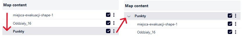
Figure 7. Add Layer to Group
Load Composition Definition
This function allows the user to load a predefined definition for a map composition from disk.
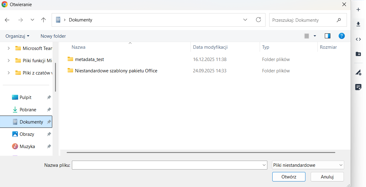
Figure 8. Load the composition definition
Edit Composition
This function allows the user to add their own rules to the code that define the composition.
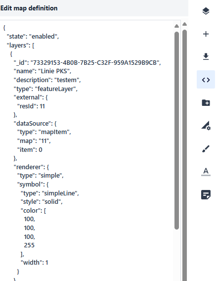
Figure 9. Edit Composition
Layer Settings
The user selects a layer from the user data list (the layer gets highlighted),
and then chooses the Layer Settings button from the right-hand menu.
Here, information about the data source and basic layer configuration parameters can be found, e.g., the layer name.
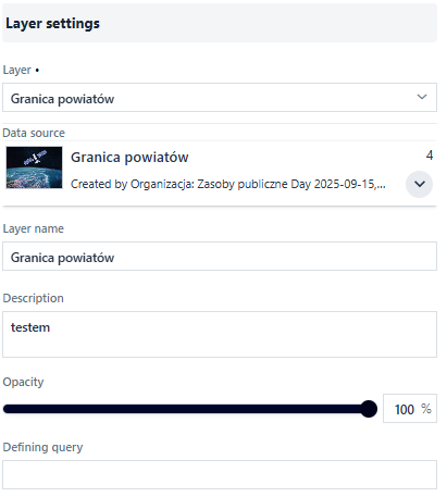
Figure 10. User Data – Layer Settings
Using checkboxes, the user decides whether the layer should be visible in the Layer List and uses the available layer options.
With the slider, the user changes the layer’s opacity percentage.
Symbolization
The user selects the Symbolization button. Tools enabling layer symbolization are displayed.
Additionally, at this point the user sets the layer’s scale range using a slider, or by typing or selecting a scale value from the list.
The scale settings apply to the EPSG:2180 coordinate system.
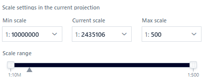
Figure 11. Layer Scale Range Configuration
The list of available options for Presentation Type depends on the layer’s geometry type.
The options from the list define the available symbol parameters for configuration.
In most cases, the symbol is complex and presented as an expandable tree.
Each tree element may also have different parameters to configure.
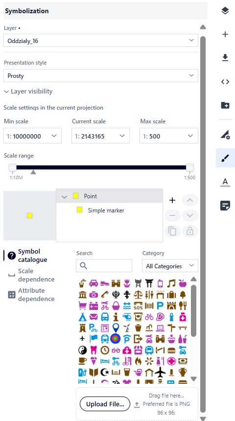
Figure 12. Symbolization Example for Point Geometry
At the main tree element level, the user can: - select a symbol from the symbol catalog, - configure scale dependency, - enable clustering and cluster labels.
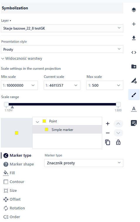
Figure 13. Symbolization Example for a Simple Marker
For the next tree element, Simple Marker, different parameters are available, such as: marker type, symbol, fill, stroke, size, offset, and rotation. Creating complex symbols (multisymbols) is possible using the right-hand panel next to the tree.
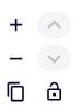
Figure 14. Multisymbol Management
The presentation type changes depending on the layer’s geometry type.
Presentation Types for Point Layers:
Simple Presentation – a simple visualization of the given geometry on the map,
Unique Values – geometry presentation depending on specific attribute values,
Choropleth – Value Ranges – geometry presentation based on defined numerical value ranges (e.g., color intensity shows phenomenon intensity),
Diagram Map – attribute presentation in the form of charts (e.g., bar, pie),
Structural-Classificatory Diagram Map – presentation of the quantity of a phenomenon using diagrams,
Composite Diagram Map – presentation of the components of a phenomenon,
Density Map – available only for points, presenting the strength of a phenomenon,
Cluster Map – available only for points, related to clustering – the more points, the stronger the phenomenon.
Presentation Types for Line Layers:
Simple Presentation – a simple visualization of geometry on the map,
Unique Values – geometry presentation depending on attribute values,
Choropleth – Value Ranges – geometry presentation based on attribute value ranges,
Ribbon Diagram Map – ribbon width illustrates the intensity of a phenomenon.
Presentation Types for Polygon Layers:
Simple Presentation – a simple visualization of geometry on the map,
Unique Values – geometry presentation depending on attribute values,
Choropleth – Value Ranges – geometry presentation based on defined numerical ranges,
Structural-Classificatory Choropleth – a composite choropleth presenting two phenomena simultaneously (the first with color, the second with hatching),
Diagram Map – attribute presentation in the form of charts (e.g., bar, pie),
Structural and Summary Diagram Map – presentation of three phenomena whose sum equals 100% (number of categories is automatically adjusted, with the option to change),
Composite Diagram Map – presentation of the components of a phenomenon.
Presentation Parameters
Depending on the selected presentation method, the User can adjust parameters such as symbol type, colors, line thickness and types, value ranges, and many others. Below are detailed descriptions of individual parameters for different presentation types and geometries.
Simple Presentation
A. In the case of point geometry, at the level of the main tree element, the User can: - select a symbol from the symbol catalog, - configure scale dependency for the point size, - enable clustering and cluster labels.
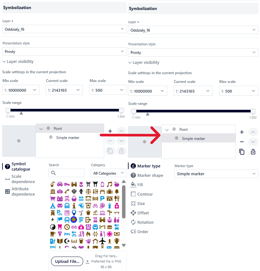
Figure 15 Simple presentation for points
Symbol Catalog
A catalog of predefined symbols with the ability to add a custom file in *.png format.
The catalog can be searched and filtered by symbol category.
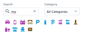
Figure 16 Symbol catalog
Scale Dependency
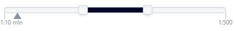
The User can set the size at which an object will be displayed depending on the map scale. The value between scales changes linearly.
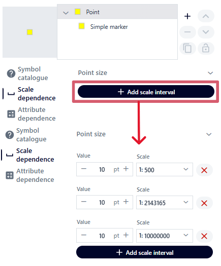
Figure 17 Scale dependency
Unique Values
For point geometry, the User can define a unique value classification based on the selected field, scale dependency, clustering, and cluster labels.
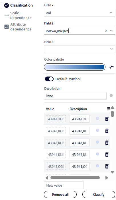
Figure 18 Unique values – point layer
Parameters:
Field – based on which the system distinguishes unique attributes.
Field 2 – selecting a second field allows combining unique values from two fields.
Field 3 – after selecting a value for Field 2, choosing a third field enables combinations of unique values from three fields.
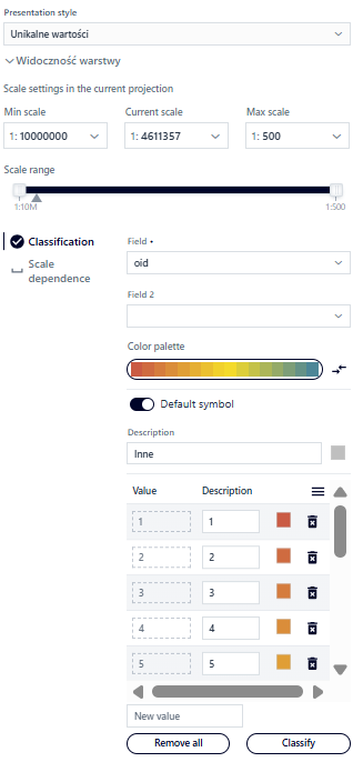
Color palette – predefined color palettes to choose from, with the option to reverse the default order.
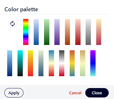
Figure 19 Unique values – color palette
After selecting a color palette: buttons {Apply} and {Close}.
Once a palette is chosen, object classification is performed automatically.
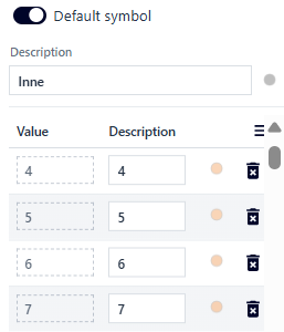
Figure 20 Unique values – selected color palette
Additional options:
Add a new value – by entering it in the
[New value]field.Edit description – by modifying the field in the
[Description]column.Delete values – the
{Delete all}button removes all added values; individual values can be deleted using thetrashbutton.Edit symbol – the button opens the symbol editor window, analogous to symbolization in the Simple presentation type.
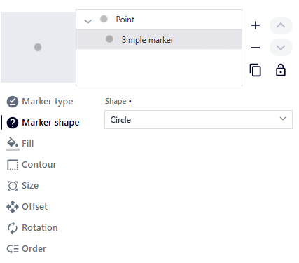
Figure 21 Point symbol editing
Surface geometry
For surface geometry, the User can define classification of unique values based on the selected field and scale dependency.
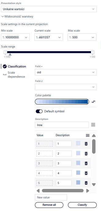
Figure 22 Unique values - surface layer
Parameters are similar to point geometry:
Field – based on which the system distinguishes unique attributes.
Field 2 – allows combinations of unique values from two fields.
Field 3 – allows combinations of unique values from three fields.
Color palette – predefined color palettes with the option to reverse order (Figure 38).
Adding a new value – enter in the
[New value]field.Editing description field – modify in column
[Description].Removing values – button
{Remove all}removes all values; single values can be removed with thetrashbutton.Symbol editing – after pressing the button, the User edits individual symbols (analogous to presentation type Simple).
After changes are made, the User selects button
{Back}.
The Scale dependency tab has been described for the Simple presentation type.
Powiedziałeś(-aś): przetłumacz na nagielski w formacie RTD Geometria liniowa ^^^^^^^^^^^^^^^^^
Dla geometrii liniowej Użytkownik może określić klasyfikację unikalnych wartości na podstawie wybranego pola oraz zależności od skali.
Rysunek 23 Unikalne wartości - warstwa liniowa
Parametryzacja jest analogiczna do geometrii punktowej:
Pole – na podstawie którego system wyróżni unikalne atrybuty.
Pole 2 – umożliwia kombinacje unikalnych wartości z dwóch pól.
Pole 3 – umożliwia kombinacje unikalnych wartości z trzech pól.
Paleta kolorów – do wyboru predefiniowane palety kolorów z możliwością odwrócenia kolejności (Rysunek 38).
Dodawanie nowej wartości – wpisanie w polu `[Nowa wartość].
Edycja pola opisu – modyfikacja w kolumnie `[Opis].
Usuwanie wartości – przycisk `{Usuń wszystko} usuwa wszystkie wartości; pojedyncze wartości można usunąć przyciskiem kosza.
Edycja symbolu – analogicznie jak dla rodzaju prezentacji Prosty.
Po wprowadzeniu zmian Użytkownik wybiera przycisk `{Powrót}.
Zakładka Zależność od skali została opisana przy symbolizacji dla rodzaju prezentacji Prosty.
Linear Geometry
For linear geometry, the User can define the classification of unique values based on the selected field and scale dependency.
Figure 23 Unique values – linear layer
The parameterization is analogous to point geometry:
Field – based on which the system distinguishes unique attributes.
Field 2 – allows combinations of unique values from two fields.
Field 3 – allows combinations of unique values from three fields.
Color palette – choose from predefined color palettes with the option to reverse the order (Figure 38).
Adding a new value – enter it in the
[New value]field.Editing the description field – modify in the
[Description]column.Deleting values – the
{Delete all}button removes all values; individual values can be deleted using thetrashbutton.Symbol editing – analogous to the Simple presentation type.
After making changes, the User selects the
{Back}button.
The Scale dependency tab is described in the symbolization section for the Simple presentation type.
Cartogram – Value Ranges
Point Geometry
For point geometry, the User can define the classification of value ranges based on the selected field, symbol, and missing data.
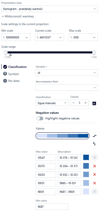
Figure 24 Cartogram – point geometry
In the {Classification} tab, the User configures the following parameters:
Variable – numeric field used to create the cartogram.
Normalizing field – optional field for data normalization (e.g., by area).
Classification – no classification (continuous cartogram), equal intervals, quantiles, natural breaks, standard deviation, custom intervals.
Number of classes – allows setting the number of classes.
Histogram – preview or edit classes based on the histogram.
Highlight negative values – option to mark negative values with a different color.
Color palette – select a predefined palette with the option to reverse the order (Figure 38).
Reverse classification – option to invert the values in the classification.
Fill editing – edit the fill color of the interval.
Delete interval – deleting an interval automatically switches to the “Custom intervals” classification.
Minimum value – by default the lowest value in the field; can be modified.
In the {Symbol} tab, the User sets common basic symbol parameters: shape, size, color, opacity, and outline thickness.
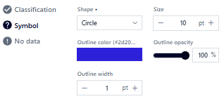
Figure 25 Cartogram – Point geometry symbol
The {Missing data} tab allows separate presentation of missing data (description and symbol appearance).
Area Geometry
For area geometry presentations, the User can define the classification of value ranges based on the selected field, symbol, and missing data.

Figure 26 Cartogram – polygon geometry
In the {Classification} tab, the User configures parameters similarly to point geometry. In the {Symbol} tab, the User sets common basic symbol parameters: fill opacity, color, and outline opacity and thickness.
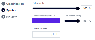
Figure 27 Cartogram – Area geometry symbol
The {Missing data} tab allows separate presentation of missing data (description and symbol appearance).
Linear Geometry
For linear geometry presentations, the User can define the classification of value ranges based on the selected field, symbol, and missing data.
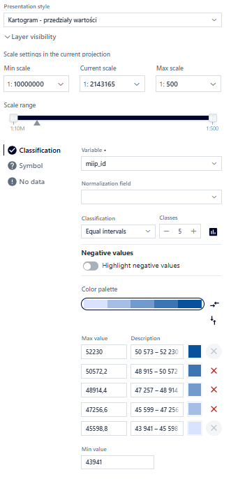
Figure 28 Cartogram – Linear geometry symbol
The {Missing data} tab allows separate presentation of missing data (description and symbol appearance).
Labeling
The User selects the {Labeling} button. The configuration window is displayed.
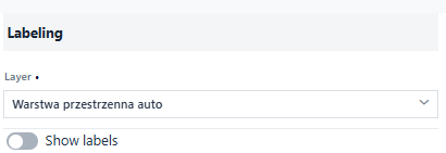
Figure 29 Labeling
The User selects a layer and activates the toggle. The system displays the parameters for configuration.
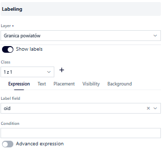
Figure 30 Labeling parameters
It is possible to create label classes using { +} and symbolize each class differently.
The {Expression} tab:
Label field – attribute to display as labels
Condition – only objects that meet the condition
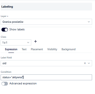
Figure 31 Labeling – condition
Advanced Expression
The User can construct an advanced expression by activating the ( ) toggle. The system displays a form for building advanced expressions.
The User uses the field search and logical operators to create an expression according to which labels will be displayed.
To include a specific field in the expression, it can be entered in the appropriate format.
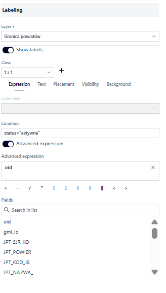
Figure 32 Labeling – advanced expression
In the {Text} tab, the User configures parameters related to the appearance of labels:
Font – Open Sans, Roboto, or Fira Sans
Size
Text color and opacity
Bold and Italic
Rotation
X and Y offset
Outline thickness, color, and opacity
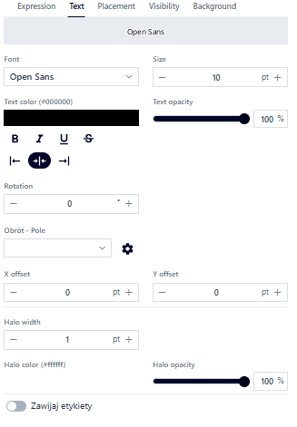
Figure 33 Labeling – text
In the {Position} tab, the User can set the position relative to the point: top, top-left, top-right, bottom, bottom-left, bottom-right, centered on the point, left, or right. The configuration is done by selecting a value from the list. For polygons, there is only one option: horizontally inside the polygon. Similarly, for lines, the only option is: centered along the line. Additionally, the Label conflict resolution option, which is enabled by default, prevents label overlapping.
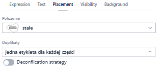
Figure 34 Labeling – position
In the {Visibility} tab, the User sets the display range of labels by entering minimum and maximum scales, selecting a scale from the list, or using sliders.
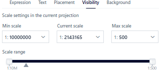
Figure 35 Labeling – visibility
In the {Background} tab, the User can add a background to the label. To do this, activate the ( ) toggle.
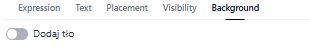
Figure 36 Labeling – background
Metadata
In the {Metadata} tab, the User decides which information will be displayed for the added application.
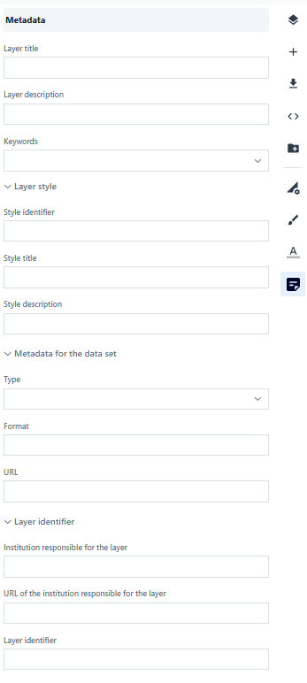
Figure 37 Metadata
7. Service Settings
The Service Settings tab contains tools for preparing a dynamic or tiled service (e.g., WMS or WMTS).
To use the services outside the system, the resource must be made public in the Resource Manager.
Note! Before accessing this tab, the map must be saved.
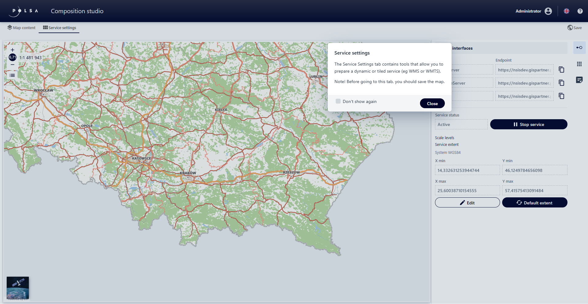
Figure 38 Service settings
Service Interfaces
In the {Service Interfaces} tab, the User can edit the scope, service data, as well as stop the service.
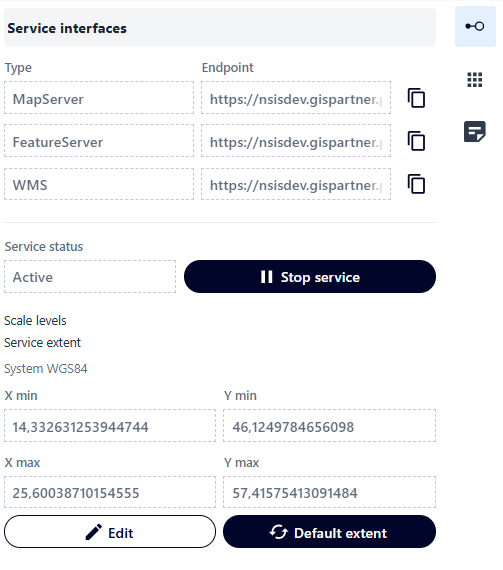
Figure 39 Service interfaces
Tiles
In the {Tiles} tab, the User can add tiles that define the service. The User adds a new tile by using the button:
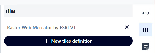
Figure 40 Tiles
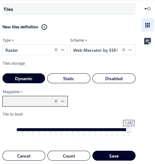
Figure 41 Tiles – new tile definition
Metadata
In the {Metadata} tab, the User decides which information will be displayed for the added application.
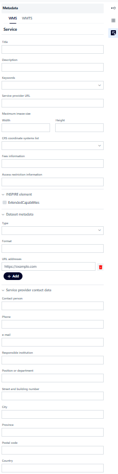
Figure 42 Metadata