Map Application Studio
1. Application description
Map Application Studio is used to create map applications to present spatial data on background maps.
Map Application Studio does not require any installation or configuration process – it is opened directly in the web browser window (it also does not require the installation of additional plug-ins).
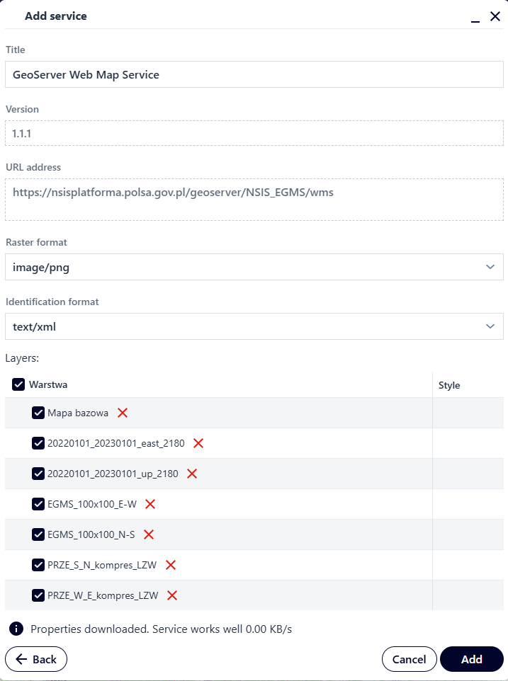
Figure 1 Launching the Map Application Studio
2. Application features
This section describes the individual features of the Map Studio, which are available to logged-in u sers. The top panel consists of the following tabs:
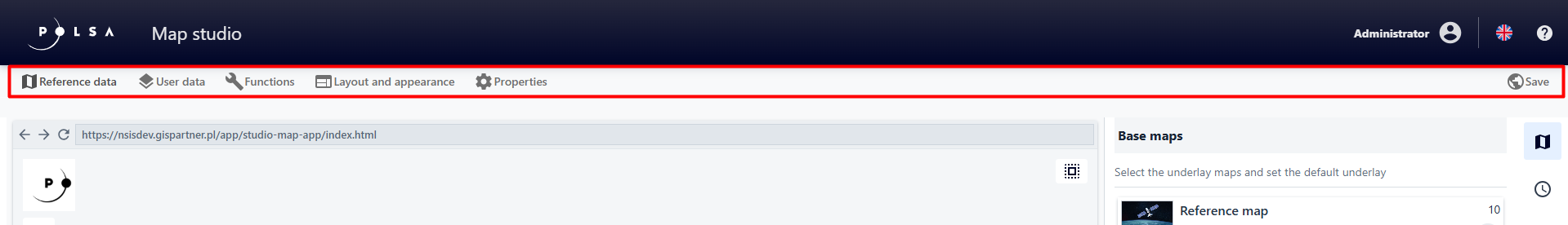
Figure 2 Map Application Studio - Tabs
Reference data – a set of settings for background maps, search services that are used as a basis for creating applications.
User data – a place to define the style and function of user data.
Features – selection of general application functions and their parameters.
** Layout and appearance ** – configuring the appearance, the way of opening functions, the settings of toolbars that group functions, logos and application names.
** Properties ** – configuration of the starting range and map scale range.
Save – enabling modification of, for example, the name, description and keywords for the map application and then saving it in the resource manager.
Reference Data
In the Reference data tab ( ), the user selects the background maps that will be available in their application from a list. Map selection is performed by clicking on its name. The selected map is highlighted in navy blue. Users can select multiple background maps.
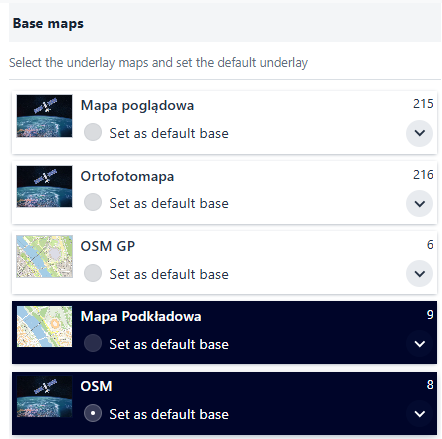
Figure 3 List of Background Maps
The user can choose which background map will be displayed when the application is launched. To do this, the user selects the radiobutton under the background map’s name.
Note!
User can only select one map as default.
In the Reference Data tab, the user can enable the time bar and background map comparison.
Right side panel for the Reference Data tab.
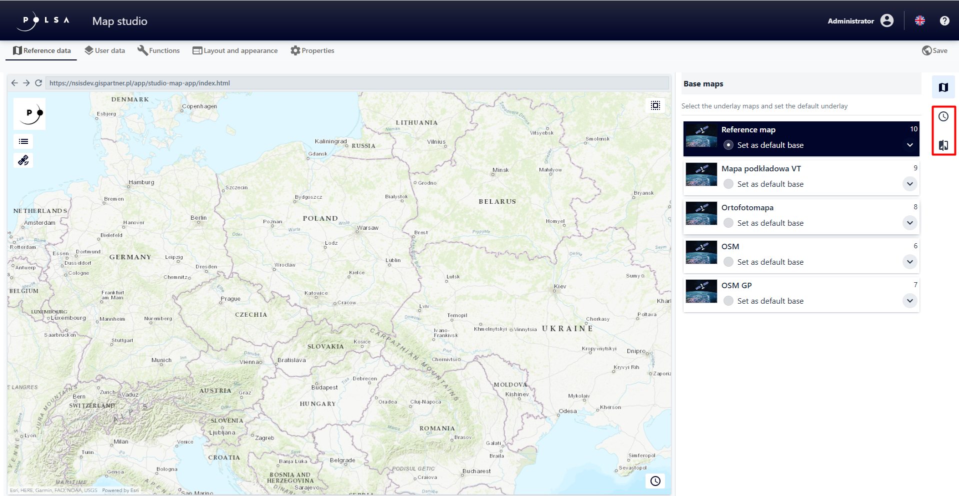
Figure 4 Background Maps - Sidebar
Time bar
A time-background map, also known as a time map, is a tool that allows you to visualize geospatial information in a historical context or according to a specific time period.It allows users to view data on a map that is related to specific time periods or changes over time. For example, a background map shows changes in an orthophoto map over time. Users can browse the map to see how the imaging Earth’s surface has changed over time.
The user selects the Background Map Time bar button ( ) to display a window where user can select a background map and set the time bar parameters.
The Time bar Background Map type must be active in the background map list. The Time bar background map is configured only by the System Administrator and can present background data from different time periods, for example Orthophoto Time bar
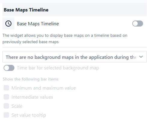
Figure 5 Background Map Time Bar
The user activates the switch and then selects the layer in the list for which the time bar will be configured.
Comparison panel
The comparison panel allows you to compare two different background maps if at least two maps have been activated for the map application. The user selects the Comparison Panel button ( ) and then toggles the switch to the activated position.
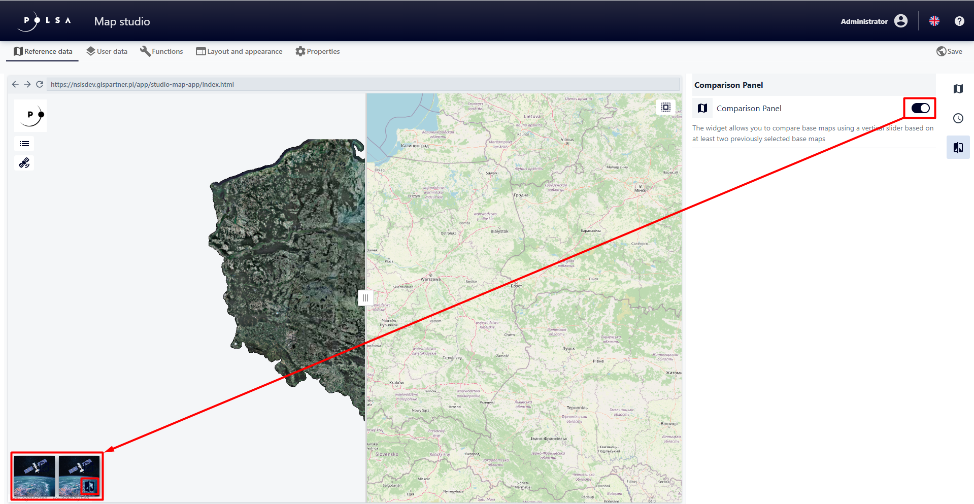
Figure 6 Background Map Comparison Panel
User Data
In the User data tab( ) the user can add and configure the map content in the created application:
resource data („Add data”
 )
)map service („Add service”
 ) .
) .
“User data” primarily consists of spatial layers (resource data) created in the Resource Manager, which are represented by dynamic services. Their configuration, including symbology, is performed in the Map Application Studio. User Data can also be map services developed outside of the Map Application Studio, for example in the Map Composition Studio.
The choice of the type of user data used in the created map application, for example whether it will be a data resource or map services , should be made based on the characteristics of the source spatial layer. Generally, adding a resource data of type is sufficient. However, if the layer has many objects and/or attributes, or complex geometry (a large number of vertices), the displayed layer may perform inefficiently, for example it will take a long time to load and browser performance may be slow. In such a case, it is recommended to create a map service for this type of layer (in Map Layout Studio) and add it as a service (“Add service” ) to the map content.
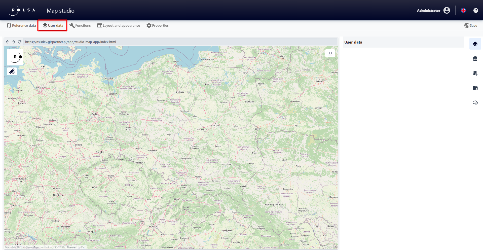
Figure 7 User Data
Add Data
To add a new data resource, select the Add data button (). A window appears allowing you to search for data and add it to the application.
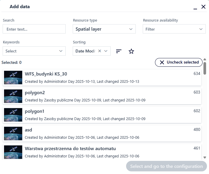
Figure 8 Adding Data
The user can select a resource directly from the list or search for a resource using the available filters.
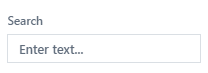 - allows user to search for a resource by name;
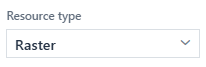 - allows user to filter by the type of resource selected from the list;
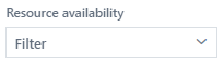 - allows user to filter by the availability of a resource selected from the list;
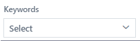 - allows user to filter by keywords of the resource selected from the list;
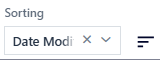 - allows user to filter by resource characteristics selected from the list (name, identifier, creation date, modification date);
 - allows user to filter resources marked as favorites.
The user selects the resource by clicking on its name and then selects the Select and go to configuration button.
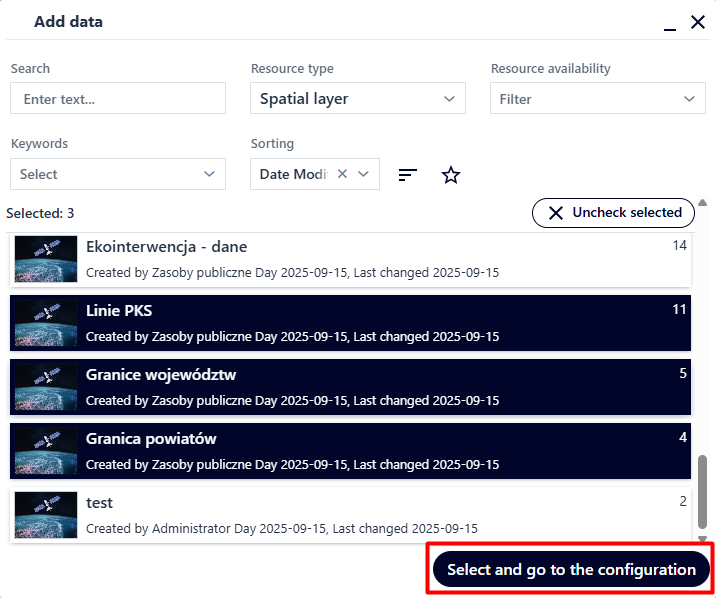
Figure 9 Data filtration and selection
The specified resource is added to the application. The user can add more than one data resource at a time.
Figure 10 Data Panel
The Menu button ( ), next to a layer, provides a context menu with the Duplicate and Delete options. The duplicate layer has the same configuration parameters as the source layer.
Add Group
The user selects the Add Group button ( ). The tool widget is displayed.
Figure 11 Adding a Group
The user enters a name for the group and selects the Save button. The group is added and appears in bold text in the layer list. To add layers to the group, the user drags and drops the layers visible in the layer list.
|
|
Figure 12 Data Grouping
Add a service from the Catalog
The user can add services from both the catalog and external services. To add a catalog service, the user select the Add Service button (08). A window appears allowing user to add a service from the list.
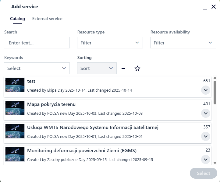
Figure 13 Adding a Service
The user can add a service by selecting it from the list or searching using available filters. The user selects the service by clicking and then selecting the Select button.

Figure 14 Adding a Service
The settings window for the selected service displays. It is possible to change the title of the service being added. Using the checkbox, the user selects the layers initially visible in the service being added, and using the red cross, user decides whether to add the layer. After setting the parameters, the user selects the Add button, and the service is added to the application.
Add an external service
To add a service outside the list of predefined services, the user goes to the External Service tab.
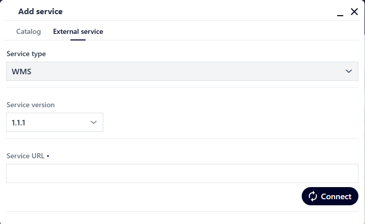
Figure 15 Adding an External Service
The user selects [Service Type] from the list (MapServer / WMS / WMTS / VectorTile), and then paste the link to the external service into the [Service URL] field and select the Connect button. In the next window, the user specifies the remaining service parameters and selects the Add button. The service is added to the application.
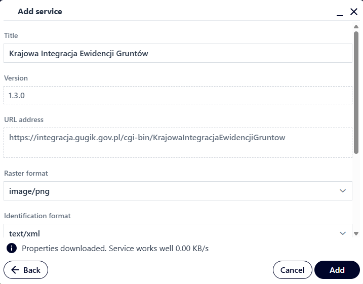
Figure 16 Adding an External Service
Layer settings
The user selects a layer in the user data list (the layer is highlighted in gray) and then selects the Layer Settings button ( ) from the right menu. Depending on the type of layer added, this may include information about the data source and basic layer configuration parameters, for example the layer name or opacity.
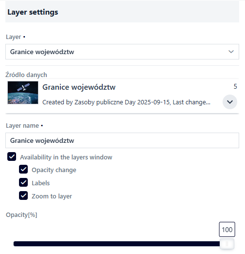
Figure 17 Layer Settings
The user uses checkboxes to decide whether the layer should be visible in the Layer List and to specify the available layer options. The slider changes the ‘%’ opacity for the layer.
Symbolization
The user selects the Symbolization button ( ). Tools for symbolizing the layer are displayed. Additionally, the user can set the layer’s scale range here using the slider or by entering or selecting a scale value from the list. Scale settings apply to the EPSG 2180 system.
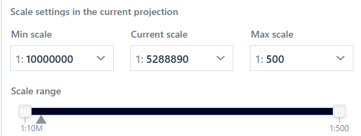
Figure 18 Symbolization - Scale Settings
The list of available options for Presentation Type depends on the layer geometry type, while the options from the list define the available symbol parameters for configuration. In most cases, the symbol is complex and presented as an expandable “tree.” Each element of the tree can also have different configurable parameters.
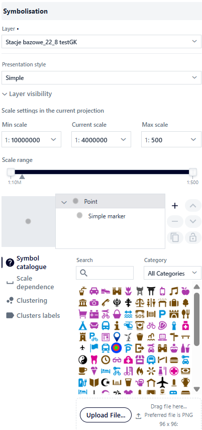
Figure 19 Symbolization Panel
The figure illustrates the symbology look using point geometry as an example. At the root element level of the tree, the user can: select a symbol from the symbol catalog, and configure scale dependency.
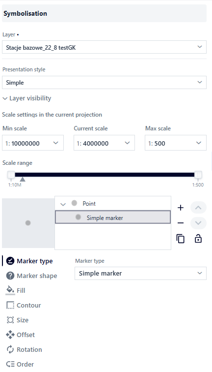
Figure 20 Symbolization Panel for Point Layer
For the next element of the tree, the Simple Marker, other parameters are available, such as fill type, fill, outline, and order. Creating complex symbols, known as multisymbols, is possible using the right panel next to the tree.
Figure 21 Tag Management Panel
 – Add a symbol tree element.
 – Delete a symbol tree element.
 - Move a symbol tree element up or down.
 - Copy symbol tree element.
 - Lock symbol tree element.
The type of presentation changes depending on the type of layer geometry.
Presentation types for the point layer:
Simple presentation – it is a simple visualization of a given geometry on a map,
Unique values – the application presents a given geometry depending on the specific value of its attributes.
Cartogram – value ranges – involves presenting a given geometry based on defined value ranges of its numerical attributes. A cartogram map is very good at showing the intensity of certain values, for example, by using increasingly intense colors.
Presentation types for linear layer:
Simple presentation – this is a simple visualization of a given geometry on a map.
Unique values – the application presents a given geometry depending on the specific value of its attributes.
Cartogram – value ranges – involves presenting a given geometry based on defined value ranges of its numerical attributes. A cartogram map is very good at showing the intensity of certain values, for example, by using increasingly intense colors.
Types of presentation for a polygon layer:
Simple presentation – this is a simple visualization of a given geometry on a map.
Unique values – the application presents a given geometry depending on the specific value of its attributes.
Cartogram – value ranges – involves presenting a given geometry based on defined value ranges of its numerical attributes. A cartogram map is very good at showing the intensity of certain values, for example, by using increasingly intense colors.
Presentation parameters - simple presentation
In the case of point geometry, the user at the root level of the tree element can: select a symbol from the symbol catalog, configure scale dependency for the point size, enable clustering and cluster labels.
Figure 22 Symbolization - Simple Presentation
Symbol Catalog – a catalog of predefined symbols with the option to add your own *.png file. The catalog can be searched and filtered by symbol category.
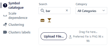
Figure 23 Symbolization - Symbol Catalog
Scale Dependency – the user can set the size at which an object will be displayed depending on the map scale. The value will change linearly between scales.
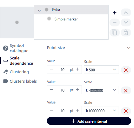
Figure 24 Symbolization - Scale Dependence
Clustering - the user can enable point group symbolization (clusters) by going to the Clusters tab and activating the toggle. Points will then be clustered (grouped), meaning points clustered within a certain area will appear as a single point. This option is available for point geometry and the Simple presentation and Unique Values presentation types.
The user controls the cluster density and size range using sliders. Using the list, they can set the scale to which points are to be clustered. It is also possible to configure a custom cluster symbol, which will be a single common symbol for all clusters. The cluster symbol is configured similarly to the symbol for the Simple presentation type.
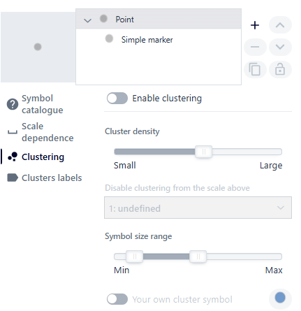
Figure 25 Symbolization - Clustering
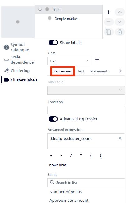
Cluster labels – by going to the {Cluster labels} tab, the user activates labeling using a switch. Using the buttons (
 ), they manage label classes, as the system allows the creation of several label classes.
Next are the available vertical tabs such as Expression, Text, Position and Visibility.
In the Expression tab, the user selects the field to be labeled from the list [Number of points, Approximate quantity]. Additionally, user can define a label display condition or enable Advanced Expression. Using Advanced Expressions, the user can create complex labels using the available options ( ) and available fields.
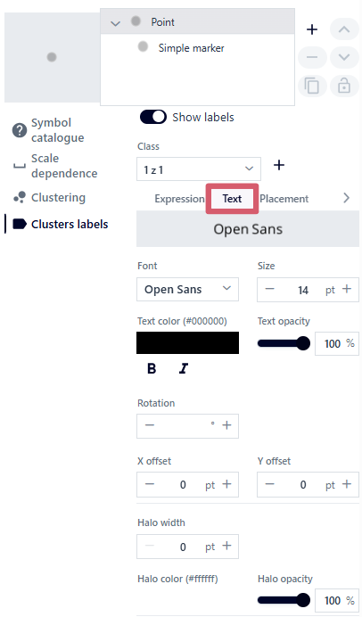
In the Text tab, the user configures the label’s appearance by selecting available fonts, size, text color, opacity, boldness, skew, rotation, x and y offset, thickness, border color, and opacity.
) and available fields.
In the Text tab, the user configures the label’s appearance by selecting available fonts, size, text color, opacity, boldness, skew, rotation, x and y offset, thickness, border color, and opacity.
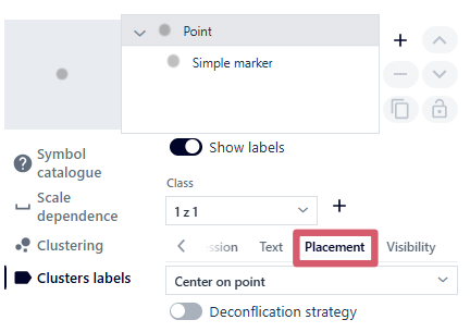
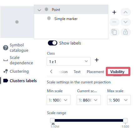
The Position tab allows you to configure the label’s position relative to the point and enable label conflict resolution. By default, this option is disabled, meaning labels are not moved apart in any way, which could result in them overlapping. Enabling this option will prevent labels from overlapping. In the Visibility tab, the user specifies the scale range of label visibility, similarly to the scale range of the layer display.
|
|
|
|
Figure 26 Symbolization - Cluster Labels
For the next element of the tree, the Simple Marker, other parameters are available, such as: marker type, symbol, fill, outline, size, shift and rotation.
Marker Type: Simple Marker, Raster Graphic, Vector Graphic. The user selects the marker type from the drop-down list.
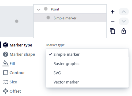
Figure 27 Tag Type
Symbol – marker shape – there are 5 types of shapes to choose from: circle, square, rhombus, cross, cross.
Fill – the color and opacity of the marker fill.
Outline – line style, color, opacity, and width of the marker outline.
Size – symbol size.
Offset – shifting the symbol in the X and Y axes.
Rotation – the value expressed in degrees by which the symbol will be rotated.
Order
For raster graphics, these are: symbol, size, offset, rotation. In this case, the symbol tab contains a library of symbols. For vector graphics, this includes: symbol, size, offset, alignment (vertical—base, top, center, bottom; horizontal—justified, left, center, right), SVG (option to paste your own SVG symbol definition).
For surface geometry presentations, the user can select a symbol from the symbol catalog at the main tree element level and configure the scale dependency for the outline width. This is done in the same way as for point geometry. For the next element of the tree, Simple Fill, parameters such as fill type, fill, and outline are available. Depending on the type of fill, tabs differ in content. For line fills, these are: outline, rotation, offset, spacing. For marker fills, these are: outline, offset, spacing. For centroid fills, these are: outline.
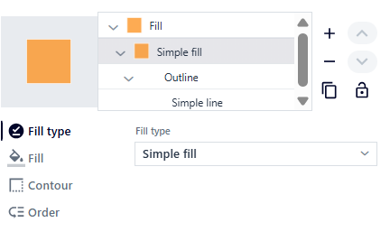
Figure 28 Surface Geometry Marker - simple fill
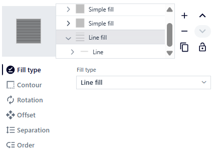
Figure 29 Surface Geometry Marker - line fill
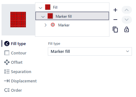
Figure 30 Surface Geometry Marker - marker fill
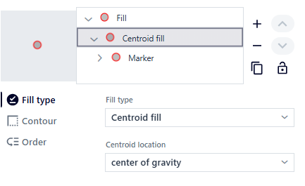
Figure 31 Surface Geometry Marker - centroid fill
The user sets the following parameters:
Fill type – user can choose between solid fill, lines, markers, and centroid. Depending on the fill type, the following tabs will vary.
Fill – color and opacity level of polygon fill.
Outline – line style, color, opacity, and width of polygon outlines.
Rotation – the value expressed in degrees by which the line will be rotated.
Offset – moving a line along the Y axis or markers along the X and Y axes.
Spacing – the distance between individual lines or markers.
Order
For linear geometry presentations, the user can specify object symbols, layer transparency, and object visibility.
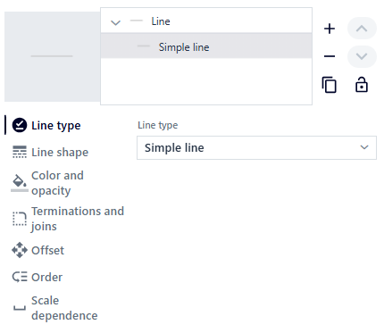
Figure 32 Linear Geometry Marker
The system generates a window in which the user can select the line style (solid, dashed, etc.), color, transparency, and line width.
The user sets the following parameters:
Line type – user can choose between a straight line and a dotted line. Depending on the fill type, the following tabs will vary.
Line style (straight line) – line width and drawing style: continuous, dot, dash, dash-dot, dash-dot-dot, custom line style, none. For a custom line style, the user can define their own drawing pattern by specifying pairs of values for line length and spacing. Optionally, user can enable drawing lines proportionally to the width.
Line style (line with markers) – marker location: at intervals, at the first vertex, at the last vertex, at the midpoint, at all vertices except the first and last, rotate with the direction of the line
Color and coverage – color and coverage level of the line.
Endings and joints – line ending type: none, rounded, square, and joint type: diagonal, rounded, pointed.
Offset – shifting the line along the Y-axis.
Order
Dependence on scale
Type of presentation - unique values
For point geometry presentations, the user can specify the classification of unique values based on the selected field, scale dependency, clustering, and cluster labels.
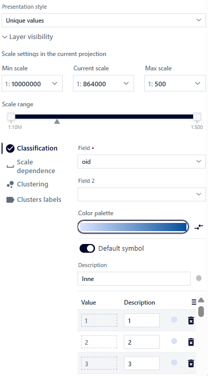
Figure 33 Presentation Type for Point Geometry
The system generates a window in which the user specifies the following parameters: - Field – based on which the system will distinguish unique attributes. - Field 2 – selecting the second field will enable combinations of unique values from two fields. - Field 3 – after selecting a value for Field 2, selecting the third field will enable combinations of unique values from the three fields. - Color palette – user can choose from predefined color palettes with the option to reverse the default order.
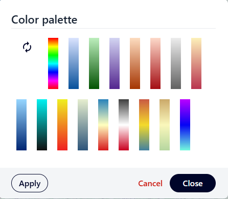
Figure 34 Color Palette
After selecting a color palette, the user selects the Apply button and then Close. After selecting the palette, object classification occurs automatically.
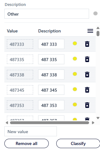
Figure 35 Value Classification
The user can add a new value by entering it in the [New Value] field, edit the field in the [Description] column, and use the Remove All button to remove previously added values. Individual values can be deleted using the (
 ) button.
(
 ) - Edit symbol – after selecting the button, a window is displayed in which the user can edit individual symbols, similarly to the symbolization for the Simple presentation type.
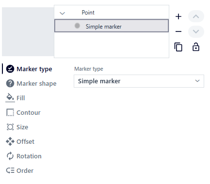
Figure 36 Simple Marker
After making changes, the user selects the Back button.
The user can configure the name and symbol of the default values (for values that do not belong to any unique value).
Tabs such as Scale Dependence, Clustering, and Cluster Labels are described in the symbology for the Simple presentation type.
In the case of a presentation for surface geometry, the user can determine the classification of unique values based on the selected field and the dependence on the scale.
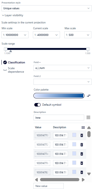
Figure 37 Surface Geometry Value Classification
In the case of the presentation for surface geometry, the parameterization is very similar to that for points:
Field – based on which the system will distinguish unique attributes.
Field 2 – selecting the second field will enable combinations of unique values from two fields.
Pole 3 – po wybraniu wartości dla Pole 2, wybór trzeciego umożliwi kombinacje unikalnych wartości z trzech pól.
Color palette – you can choose from predefined color palettes with the option to reverse the default order.
The user can add a new value by entering it in the [New value] field, edit the field from the [Description] column, and use the Delete all button to delete previously added values. Individual values can be deleted using the (
) button.(
 ) - Edit symbol – after selecting this button, a window appears in which the user can edit individual symbols, similarly to the symbolization for the Simple presentation type. After making changes, the User selects the Back button.
The user can configure the name and symbol of default values (for values that do not belong to any unique value). The Scale dependency tab is described in the symbolization for the Simple presentation type.
For linear geometry presentations, the User can specify the classification of unique values based on the selected field and scale dependency.
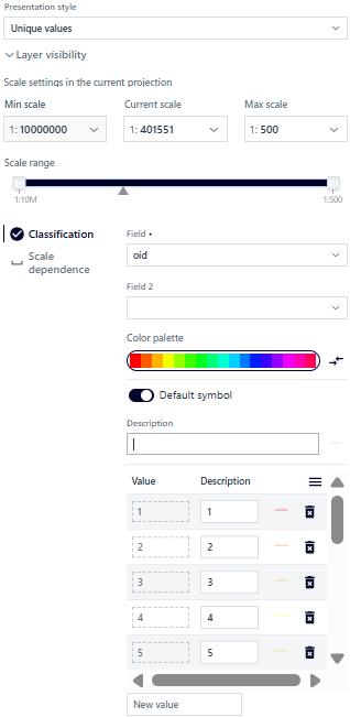
Figure 38 Value Classification for Linear Geometry
For linear geometry presentations, parameterization is very similar to the following points:
Field – based on which the system will distinguish unique attributes.
Field 2 – selecting the second field will enable combinations of unique values from two fields.
Field 3 – after selecting a value for Field 2, selecting the third field will enable combinations of unique values from the three fields.
Color palette – you can choose from predefined color palettes with the option to reverse the default order.
The user can add a new value by entering it in the [New value] field, edit the field from the [Description] column, and use the Delete all button to delete previously added values. Individual values can be deleted using the () button.
- ( ) - Edit symbol – after selecting this button, a window appears in which the user can edit individual symbols, similarly to the symbolization for the Simple presentation type. After making changes, the user selects the Back button.
The user can configure the name and symbol of default values (for values that do not belong to any unique value). The Scale dependency tab is described in the symbolization for the Simple presentation type.
Type of presentation - Cartogram - value ranges
In the case of point geometry presentations, the user can specify the classification of value ranges based on the selected field, symbol, and missing data.
Figure 39 Cartogram - Value Ranges - Classification
In the Classification tab, the user configures the following parameters:
Variable - a numeric field based on which the cartogram will be created.
Normalization field – an optional checkbox from the list, which is used to normalize the displayed data (for example using the area field) for data comparison purposes.
The choice of normalization field affects the intervals and their descriptions. Due to the inability to use the accuracy of the data after normalization, the intervals are left-open.
Classification – there are several types of classification to choose from: no classification (continuous cartogram), equal intervals, quantiles, natural intervals, standard deviation, custom intervals.
The description of the intervals depends on the type and precision of the fields configured in the Layer Structure (Resource Manager). For integers and floating-point numbers with a defined precision > 0, the descriptions do not overlap. For floating-point numbers with a precision of 0, the descriptions are left-open.
Number of classes – the ability to set the number of classes for selected classification types.
Histogram (
 ) – preview the distribution of values or edit classes based on the distribution of values in the histogram, depending on the classification type.
Highlighting negative values – data with negative values can be highlighted using a different fill color.
Color palette – you can choose from predefined color palettes with the option to reverse the default order (Figure 38).
 - Reverse classification – this option allows the user to reverse the values in the classification.
- - Edit fill – after selecting this button, a window appears in which the user can edit the fill color of the interval.
 - Delete range – deleting the selected range automatically switches to the “Custom ranges” classification.
Minimum value – by default, the lowest value in a given field is displayed, which can be modified.
In the Symbol tab, the user sets common basic parameters for the symbol: shape, size, color, opacity, and outline thickness.
Figure 40 Cartogram - Value Ranges - Symbol
The No data tab allows for separate presentation of missing data (description and symbol appearance).
In the case of presentation for *surface geometry*, the user has the option to specify the classification of value ranges based on the selected field, symbol, and missing data.
Figure 41 Cartogram for Surface Geometry - Classification
In the Classification tab, the user configures the parameters in the same way as for point geometry. In the Symbol tab, the user sets common basic parameters for the symbol: fill opacity, color, opacity, and outline thickness.
Figure 42 Cartogram for Point Geometry - Symbol
The No data tab allows for separate presentation of missing data (description and symbol appearance).
In the case of presentation for *linear geometry*, the user has the option to specify the classification of value ranges based on the selected field, symbol, and missing data.
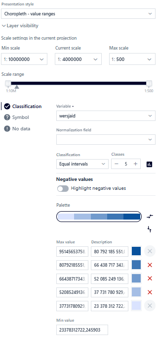
Figure 43 Cartogram for Linear Geometry - Classification
In the Classification tab, the user configures the parameters in the same way as for point geometry. In the Symbol tab, the user sets common basic parameters for the symbol: line width and style.
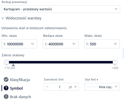
Figure 44 Cartogram for Linear Geometry - Symbol
The No data tab allows you to display missing data separately (description and symbol appearance).
Labeling
The user selects the Labeling button under the icon ( ). The configuration window is displayed.
Figure 45 Tool Panel
The user selects the layer for which labels will be added from the list and activates the switch. The system displays the parameters that can be configured.
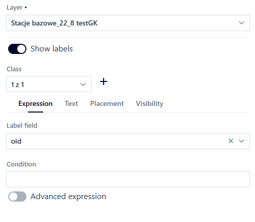
Figure 46 Launching the Tool
The user can create label classes using () and symbolize each class in a different way.
In the Expression tab, the user can specify the attribute in [Label field] for which labels will be displayed and enter a condition in the [Condition] field to show labels only for objects that meet the condition.
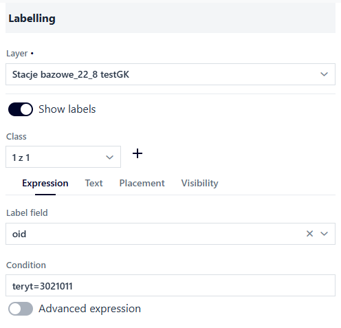
Figure 47 Setting the Condition
The user can construct an advanced expression. To do this, the user activates the switch. The system displays a form for constructing advanced expressions. Using the field search engine and logical operators, the user constructs an expression according to which the labels will be displayed. In order to construct an expression containing a specific field, it can be entered as follows: (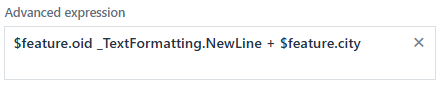 )
)
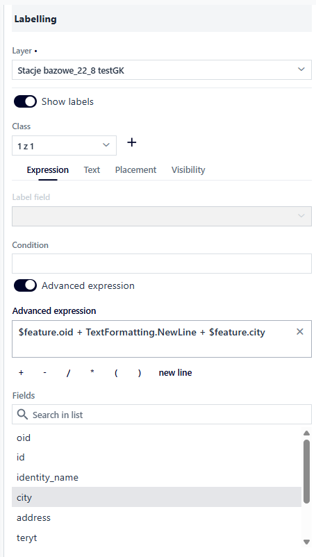
Figure 48 Advanced Expression
In the Text tab, the user configures the parameters related to the appearance of labels: - Font – Open Sans, Roboto, or Fira Sans - Size - Text color and opacity - Bold and italics - Rotation - X and Y offset - Thickness, color, and opacity of the outline
Figure 49 Text Formatting
In the Position tab, the user can decide where to display the label in relation to the insertion point: at the top, at the top and left, at the top and right, at the bottom, at the bottom and left, at the bottom and right, centered on the point, on the left, on the right. The configuration is done by selecting the appropriate value from the list. For a polygon, there is only one option: horizontally in the polygon; similarly, for a line, there is only one option: in the middle of the line along its length. Additionally, the Label conflict resolution option, which is enabled by default, allows you to avoid label overlap.
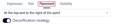
Figure 50 Position Configuration
In the Visibility tab, the user specifies the display range of labels by entering the minimum and maximum scales, selecting a scale from the list, or using sliders.
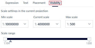
Figure 51 Defining Visibility
Table
The user selects the Table button (). The configuration window is displayed.
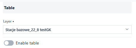
Figure 52 Tool Panel
The user selects the layer for which the table will be displayed from the list and activates the switch. The system displays the parameters that can be configured – the first tab is Column visibility.
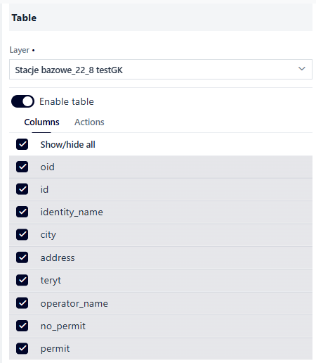
Figure 53 Launching the Tool
The user specifies which attributes will be displayed in the table in the application. The column is hidden after unchecking the checkbox. Next, the user goes to the Actions tab and selects the actions that will be available in the table from the list.
Figure 54 Defining Actions
Edit
The user can enable object editing for the layer. The user selects the Edit button ( ). A configuration window is displayed.
The user can specify the layer editing parameters by selecting the appropriate checkboxes:
adding objects,
modifying the attributes of existing objects,
modifying the geometry of existing objects,
deleting objects.
The user can specify the parameters for adding attachments to the layer by selecting the appropriate checkboxes:
adding images (jpg, png),
adding videos,
adding other files (pdf, docxx, xlsx, etc.),
deleting attachments.
Additionally, they specify the file size limit [MB] and the file quantity limit.
In the visibility of attributes in forms, the user specifies the fields available for editing. A field may be marked with a padlock symbol (//insert icon), which means that the field is mandatory and cannot be disabled for editing. This is due to the layer structure settings in the Resource Manager.
Filtering
The filter function affects not only the visibility of data on the map, but also in the table (if the table function is enabled). To activate the function, the user selects the Filter button ( ). A configuration window for the selected layer from the list is displayed. The user activates the switch for the selected filter type (simplified, attribute, spatial).
Figure 56 Filter Tool
The user can set filtering:
Simplified – The user selects the field on which to define the filter. The user selects the Set filter button. The simplified filter configuration opens in a modal window.
Figure 57 Simplified Filter Setting
First, the user specifies the Filter Name. The filter must be precisely defined so that the user using the application knows its purpose.
Next, the Configuration Mode is selected. In dynamic mode, filter values are updated as data changes. Furthermore, filters interact with each other. In static mode, values are applied once for a given moment of filter configuration.
Next, the user determines the filter’s presentation by selecting from a list.
Figure 58 Filter Presentation Method
The user has the option to configure the default filter settings that will be taken into account when the function is activated.
Attribute – The user enables the ability to define their own attribute filters or adds a predefined attribute filter that filters data initially.
The user enables attribute filtering on the layer using the toggle switch and defines which fields should be available for filtering.
Figure 59 Attribute Filtering
To define a predefined filter, the User selects the Add Predefined Filter button. The Attribute Filter window is displayed.
Figure 60 Defining Attribute Filter #1
The user enters a name in the [Filter Name] field. Then, from the list, selects the layer for which the filter will be defined.
Figure 61 Defining Attribute Filter #2
The user selects the Add Condition button. This activates the fields where the user specifies parameters. For the [Field Name] and [Operator] fields, the user selects values from the drop-down lists. For the [Value] field, the user selects the Get Values button. A window with a list of values to choose from is displayed.
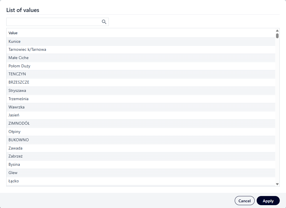
Figure 62 Selecting a Value for the Strubut Filter Condition
The user selects a value and selects the Apply button. To verify that the filter is working correctly, the user selects the Test button. The system verifies the filter’s validity and displays information about the number of returned objects. Finally, the user selects the Save and Apply button. The saved filter appears in the Filtering window.
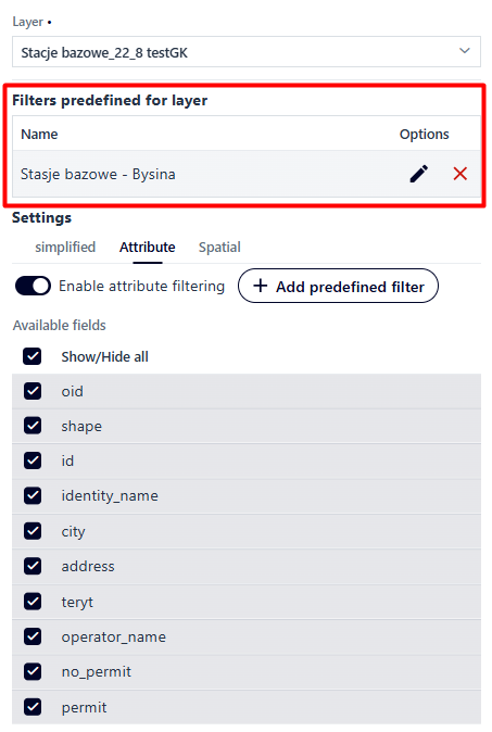
Figure 63 Defined Attribute Filter Panel
The user can edit () or delete the filter ().
While editing, a window identical to the one used to define the filter is displayed.
When deleting a filter, a message is displayed asking the user to confirm its decision.

Figure 64 Filter Removal Confirmation
Spatial - The user enables the ability to define their own spatial filters or adds a predefined spatial filter to filter data initially. The user enables spatial filtering on the layer using a toggle switch and defines which tools and types of territorial division filtering will be available in the application.
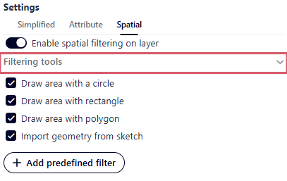
Figure 65 Spatial Filtering
To define a predefined filter, the user selects the Spatial tab and then the Add predefined filter button.
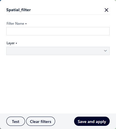
Figure 66 Defining a Spatial Filter
The user enters a filter name and selects a layer. Once completed, the spatial extent tools are activated. The user defines the area using the sketch tools.
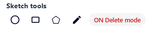
Figure 67 Filter Area Input Panel
To verify that the filter is working correctly, the user selects the {Test} button, and then the Save and Apply buton.
Selection
The user selects the Selection button ( ). A window appears in which the user selects the layer for which the selection will be enabled and then activates the switch.
Enabling selection for the selected layer will make the layer visible for selection in the map application and enable the selection of objects for analysis in the analysis panel.
Continue configuring the selection function for the map application as described in the Selection section.
). A window appears in which the user selects the layer for which the selection will be enabled and then activates the switch.
Enabling selection for the selected layer will make the layer visible for selection in the map application and enable the selection of objects for analysis in the analysis panel.
Continue configuring the selection function for the map application as described in the Selection section.
Relations
The system allows data to be presented in relation. The user selects the Relations button ( ). If data in relation has been added for the layer (at the stage of adding/editing the layer
in the Resource Manager), the resources will appear in the list.
). If data in relation has been added for the layer (at the stage of adding/editing the layer
in the Resource Manager), the resources will appear in the list.
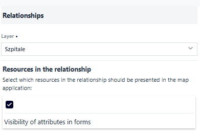
Figure 69 Relations Tool
The user can disable the display of a resource in a relationship using the checkbox next to the resource. For the selected resource, the user can choose the attributes to be displayed in the identification forms.
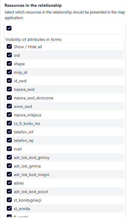
Figure 70 Resources in Relations
If the layer does not have any resources configured in the relations, the list is empty.
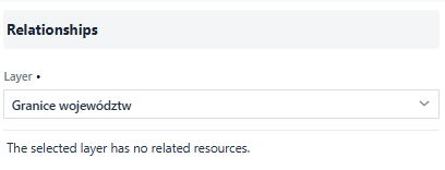
Figure 71 Layer with no Resources in the Relations
Statistics
The user selects the Statistics button ( ). A window appears in which the user selects the layer for which the statistics function will be run, and then activates the switch.
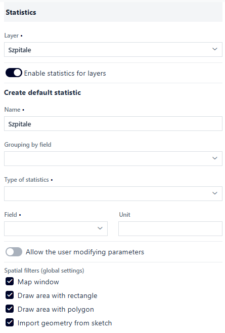
Figure 72 Statistics Tool
The user defines parameters for default statistics:
Grouping by field from the list of available attributes,
Type of statistics from the list:
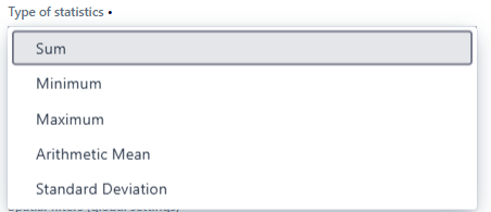
Figure 73 Types of Statistics
Field (numeric) and unit
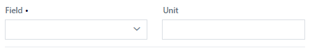
Figure 74 Field Definition
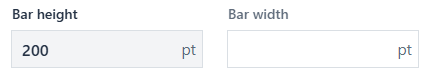
After selecting the field to group, options appear for selecting the Diagram type: semi-circular, circular, bar, and Sorting: none, value (ascending or descending), category (ascending or descending).
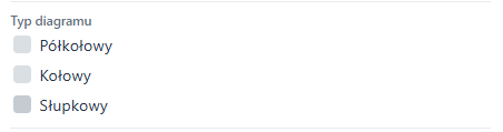
Figure 75 Chart Type
The option to modify statistics parameters by the user can also be enabled using a switch (Allow user to modify parameters). The statistics function has been expanded to include the ability to display statistics for a selected area. For this purpose, spatial filters (filtering using a map window, rectangle, polygon, sketch) are enabled by default and can be disabled using checkboxes.
Note!
When filtering by sketch is enabled, the sketching function (Functions tab) must be enabled for the user to be able to use this option.
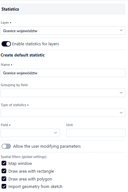
Figure 76 Statistics Tool - Defined Parameters
Field formatting
Field formatting allows user to change the presentation of fields displayed in identification forms, for example, displaying websites using interactive hyperlinks. The user selects the Field formatting button ( ) and proceed to configuration.
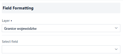
Figure 77 Field Formatting Tool
The user selects a layer from the list, then selects a field and specifies the display method. The following display methods are available:
Text – the default method of displaying values.
HTML – allows values to be displayed with HTML formatting included in the content.
Hyperlink – presents the attribute using an interactive link. The user can choose different ways to launch the hyperlink (new browser tab, modal window, file download) and define the name of the hyperlinks.
Note!
Attributes must be correctly formulated for the redirection to the website to be correct. The attributes must include the protocol, for example: https://.
Resource presentation – applies when the attribute refers to the ID application. In this case, instead of displaying the attribute, it is possible to switch to another application.
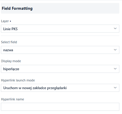
Figure 78 Field Formatting Tool - Configuration
Search and identification
The user selects the Search and identification button ( ). A window appears in which the user selects the layer for which the search and identification function will be activated, and then activates the switch. As a result, activating the switch enables two functions: searching for data in the application and identifying objects on the map.
By selecting/deselecting the appropriate checkboxes, the user can define the layer identification parameters:
). A window appears in which the user selects the layer for which the search and identification function will be activated, and then activates the switch. As a result, activating the switch enables two functions: searching for data in the application and identifying objects on the map.
By selecting/deselecting the appropriate checkboxes, the user can define the layer identification parameters:
Allow object evaluation – after activating this option, select the geo-survey created in Research Studio for the given layer
Show terrain profile – this option applies to linear objects
Attachments – display multimedia
Attachments – list of all attachments
Attachments – download attachments
Attachments – display attachments
Visibility of attributes in forms – option to select/deselect selected attributes in identification and search results
Hide empty attributes in forms – option to hide empty attributes
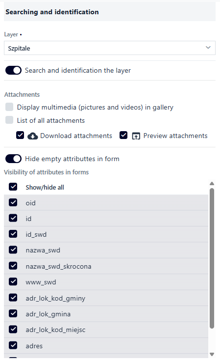
Figure 79 Search and Identification
Tooltips
Tooltips are interactive elements of the user interface that appear when you hover over an object.
The default tooltips for objects come from the Name Template and Description Template configured for a given layer in the Resource Manager in the Search tab. To activate the tooltip display function on the map, the user selects the Tooltips button ( ) button, which displays a configuration window. The user selects a layer from the list and then activates the switch. The user can override the default tooltips (from the Resource Manager) by manually entering HTML code.
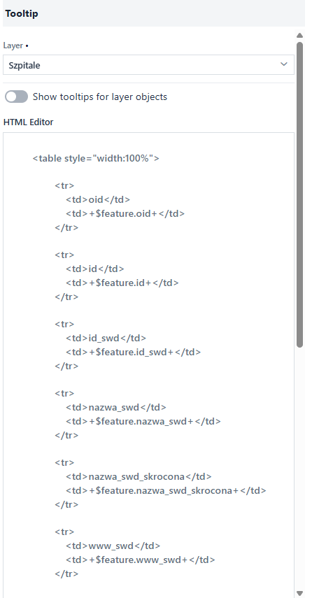
Figure 80 Tooltips
Np.:
<table style=”width:100%”>
  <tr>
    <td>Nazwa</td>
    <td>$feature.nazwa</td>
  </tr>
</table>
The above HTML code displays a tooltip in the form of a table consisting of a single element. The header is the word “Name” and “$feature.name” is the field that refers to the value of the object attribute. The editor’s tooltip window displays the names of the fields of the selected layer, which can be used when defining your own tooltip.
Legend
The user selects the Legend button ( ). The configuration window is displayed. By default, the legend display is enabled. The user can disable the visibility of the legend for the selected layer.
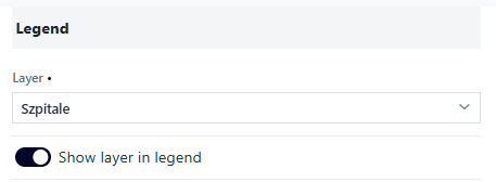
Figure 81 Legend Tool
In special cases, there are additional legend options to configure:
Block height and width (
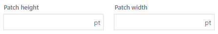 ) – for polygon layers
Filtering from the legend level (
 ) – for unique values and cartogram presentation types – value ranges
Measure label (
 ) – for cartogram-value range presentation type
Blocks with height proportional to class interval range (
 ) – for cartogram-value range presentation type
User data time bar
The user selects the User Data Time bar button ( ). A configuration window appears. The user selects a layer from the list—the layer must have a field with date and/or time values. The user then activates the switch.
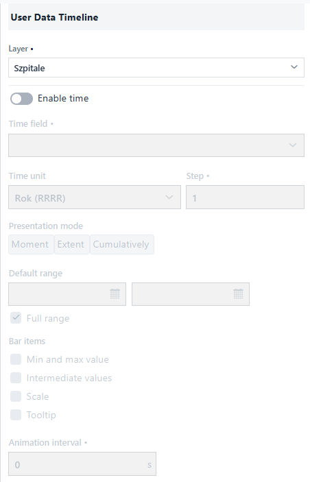
Figure 82 User Data Time Bar
The user specifies the parameters for the time bar:
Selects the field defining the object’s time from the list,
Selects the time unit from the list (year YYYY, month MM.YYYY, day DD.MM.YYYY, hour DD.MM.YYYY hh, minute DD.MM.YYYY hh:mm),
Specifies the interval of time (depending on the selected unit),
Specifies the presentation mode: moment, interval, accumulation,
Defines the default range of bar data: default interval or full range (for the Interval type), default value or latest value (for the Moment type), default value or display all (for the Accumulation type),
Defines the elements that will be displayed on the bar: minimum and maximum value, intermediate values, division, tooltip of the set value,
Determines the possibility of automatic bar animation by specifying the interval [s].
3. Features
In the Features tab ( ), the user specifies which functions will be available
in the map application. The user selects the button with the function symbol. The Switch icons (
), the user specifies which functions will be available
in the map application. The user selects the button with the function symbol. The Switch icons ( /
/ on/off, respectively) are used to enable the visibility of the function. The symbol of the enabled function displays the widget icon in the application preview window.
Full screen
Full screen ( ) allows you to display the map on the entire screen. It is enabled by activating the switch.
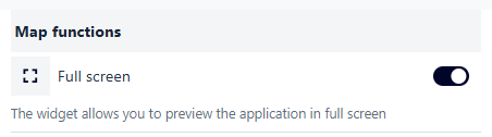
Figure 83 Tool - Full Screen
Adding a service
Adding a service () allows the application user to add external services: predefined from the catalog and/or external services. This is done by activating the switch.
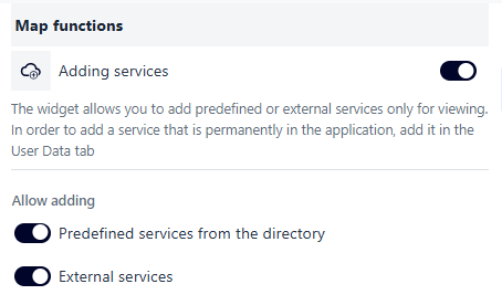
Figure 84 Adding Services
After launching the widget in the map field, the user can add predefined services of their choice in the Catalog tab. Using the available filtering tools, they search for the desired service, select it, and click the Select button.
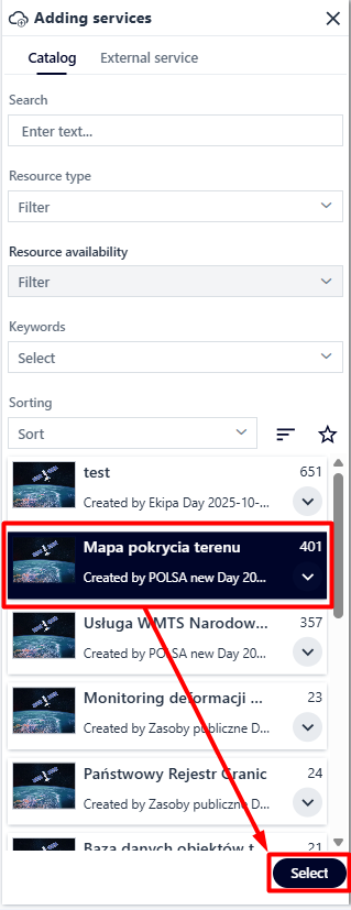
Figure 85 Adding Predefined Services #1
The user selects the checkboxes next to the to include them in the service. The user finishes the operation by clicking Add.
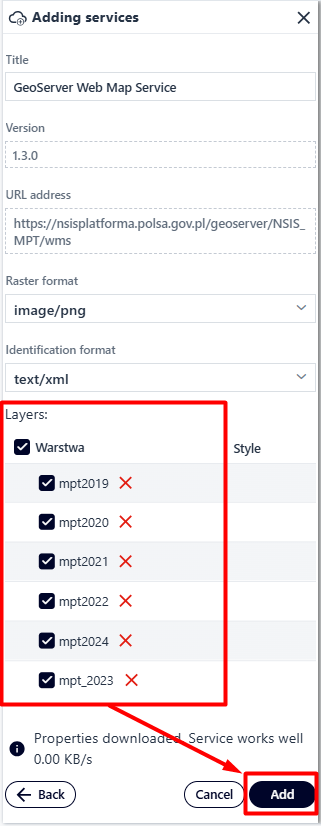
Figure 86 Adding Predefined Services #2
In the External service tab, the user defines items such as:
Service type
Service version
Service address
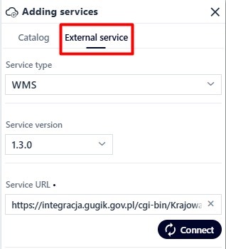
Figure 87 Adding an External Service
The final step is to mark selected or all layers in the same way as predefined services.
Measurements
Measurements ( ) enable the application user to take measurements. This is done by activating the switch
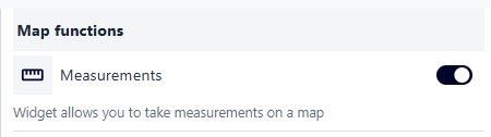
Figure 88 Launching the Measurement Tool
The user has three types of measurements available: - point - line - area
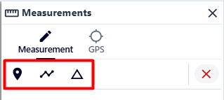
Figure 89 Available Measurement Types
Displaying coordinates
Coordinates ( ) enable the application user to take measurements. This is done by activating the switch.
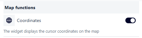
Figure 90 Launching the Coordinate Tool
Sketching
Sketching () activates the sketching tools. This is done by activating the switch.
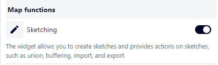
Figure 91 Launching the Sketch Tool
Drawing
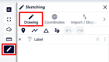
Figure 92 Drawing Tab
Point - after selecting this option, the user places a point in the desired location on the map with the left mouse button.
Line - after selecting this option, the user places points with subsequent clicks to draw a line. The operation is completed with a double click,
Polygon - after selecting this option, the user places the vertices of the polygon in the map field with subsequent clicks. The operation is completed with a double click,
Shape - after selecting this option, the user holds down the left mouse button and draws the selected shape in the map window. The operation ends when the left mouse button is released.
Coordinates
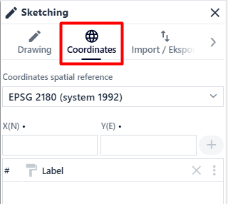
Figure 93 Coordinates Tab
In the “Coordinates” tab, the user can create a sketch based on coordinates in the selected system. The user selects the coordinate system from the “Coordinates in system” list. Then enter the coordinates in the previously selected system in the X(N) and Y(E) fields. To add another point, the user selects the button marked with a plus sign ().
Import/Eksport
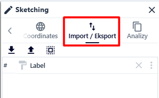
Figure 94 Import/Export Tab
In the “Import/Export” tab, the user can import or export a sketch, as well as load previously selected objects.
Analyses
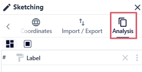
Figure 95 Analysis Tab
In the “Analyses” tab, the user can combine multiple sketches with the same geometry or create a buffer for selected sketches.
To combine sketches, the user selects the checkboxes next to the selected sketches with the same geometry and then selects the button marked with the icon ( ). Next, they can choose whether to assign the geometry of one of the components to the newly created object.
To create a buffer for the selected sketch, the user checks the checkbox next to its name and then selects the button marked with the icon (
). Next, they can choose whether to assign the geometry of one of the components to the newly created object.
To create a buffer for the selected sketch, the user checks the checkbox next to its name and then selects the button marked with the icon ( ). Next, they set the desired value and confirm with the “OK” button.
Selection
Selection () allows user to select objects on the map.
Note!
For the function to work properly, it must be activated beforehand for the selected layer in the User Data tab.
The user can choose between two types of selection: simple and complex, which can be selected using the radiobutton.
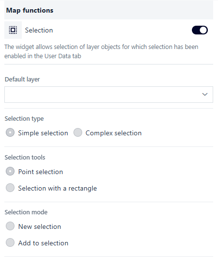
Figure 96 Selection Tool - Simple Selection
In the case of Simple Selection, the user can choose between:
Selection tools: Point Selection or Rectangular Selection,
Selection mode: New Selection or Add to Selection (option for the Point Selection tool).
These options are configured using the radiobutton next to the given selection.
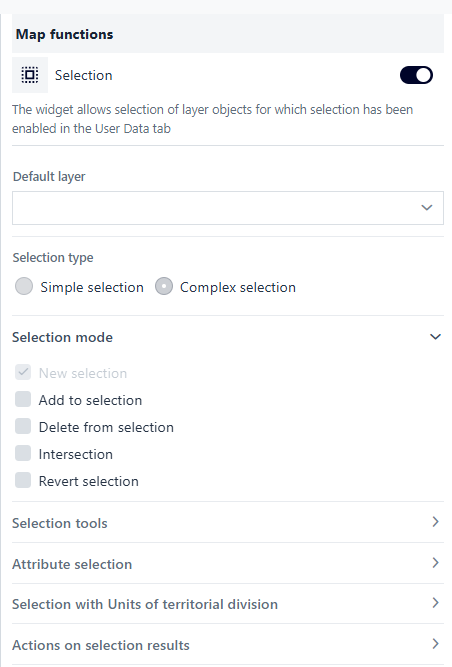
Figure 97 Selection Tool - Complex Selection
In the case of Complex Selection, the user can choose between:
Selection mode: New Selection, Add to Selection, Remove from Selection, Common Part, Invert Selection, - Selection tools: Point selection, Line selection, Rectangle selection, Polygon selection, Circle selection, Map extent selection, Sketch selection, - Attribute selection, - Selection by territorial division units: none, cadastral division, administrative units, - Actions on selection results: Zoom to results, Show in table, Export to GeoJSON, Present list of results
These options are configured using the checkbox next to the given selection.
Searching for satellite images
The user activates the widget by flipping the switch.
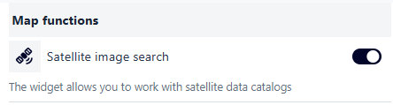
Figure 98 Launching the Satellite Image Search Tool
The widget window is opened by clicking on the icon ( ).
).
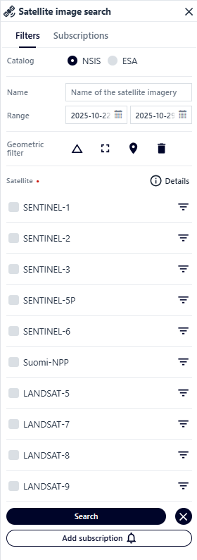
Figure 99 Satellite Image Search Tool Panel
Filters - in this tab, the user defines the parameters for the images to be searched:
Mission - NSIS applies to imagery data within the country with a buffer of 100 km from the border, ESA applies to data outside the borders of Poland

Figure 100 Mission Definition
Name
Figure 101 Name Definition
Time Frame
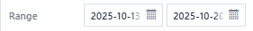
Figure 102 Time Frame Definition
Satellite Type - after expanding the filters for the selected satellite, the user can set parameters such as:
Platform
Processing Level
Product Type
Timeliness
Activation Mode
Orbit Direction
Polarization Channel
Polarization Band
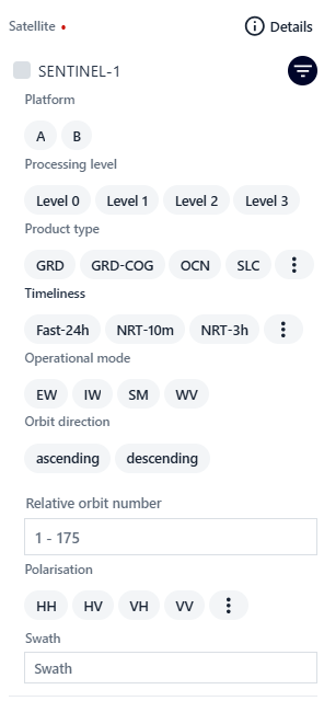
Figure 103 Satellite Type Definition
marking the area for which images are to be displayed using a geometric filter:
polygon
 - the user places the vertices of the polygon being drawn with successive clicks. The operation is completed with a double click
screen range - the user sets the map range for which images are to be searched and uses the button (
 )
)point
 - the user places a point with the left mouse button in the place for which images are to be searched
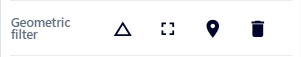
Figure 104 Geometric Filter Tools
After setting the parameters, the user can search for images using the button ( ) or create a subscription (
 ). The subscription is saved in the resource manager and updated over time when changes occur in the displayed images in the marked area.
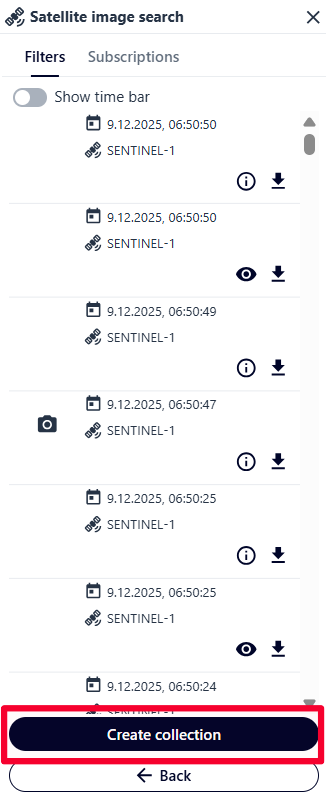
Figure 105 Creating a Raster Collection
After searching for images, the user can create a raster collection that can be used for presentation using the “Raster Collection Timeline” tool. The user selects the checkboxes next to the selected images. The operation is completed by clicking the raster collection creation button ( ).
).
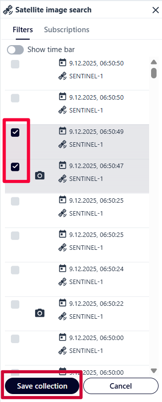
Figure 106 Saving a Raster Collection
Subscriptions
In this tab, the user can view a list of subscriptions, as well as modify their settings or activate/deactivate them.
Raster collection time bar
The time bar is activated by switching the switch in the panel after pressing the button (). After activating the tool, the user searches for the selected directory using the available filters by pressing the Add raster directory button. Then, the user customizes the time bar elements, such as:
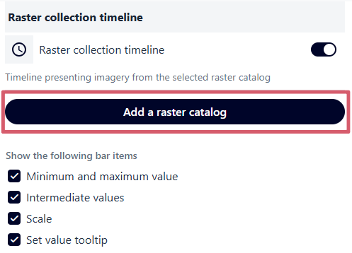
Figure 107 Adding a Raster Collection
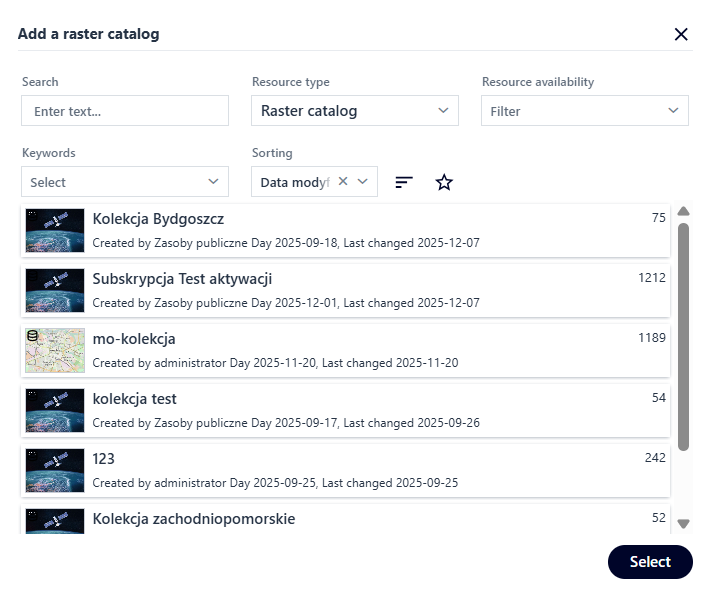
Figure 108 Selecting a Raster Collection
Minimum and maximum values
Intermediate values
Scale
Tooltip of the set value
After launching the timeline tool in the map window (), the user uses the slider to set the date for which the images are to be displayed.
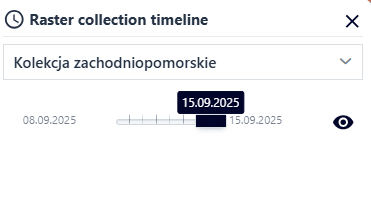
Figure 109 Time Bar Tool Window
Download data from the WCS service
The user activates the tool using a switch after selecting the button marked with the icon ( ). Then, the user launch the widget panel in the map field.
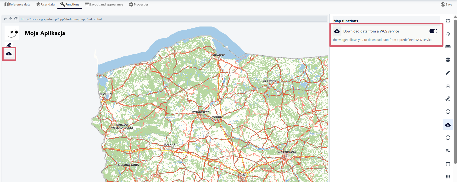
Figure 110 Launching the WCS Service Data Download Tool
It defines the following:
WCS service
Theme group
Layer
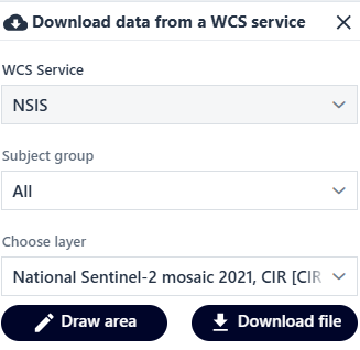
Figure 111 Tool Window
The user can draw an area for which spatial data is to be downloaded or download a file.
Displaying information
After launching the widget with the switch ( ), the user defines the Title of the information window and enters their own text in a simple text editor or in HTML format. It is possible to load external HTML. The user selects the checkbox and then loads the URL address.
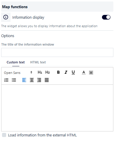
Figure 112 Application Data Display Tool Configuration #1
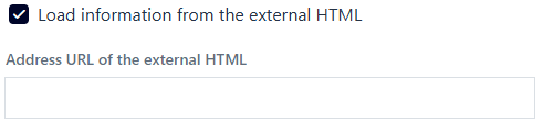
Figure 113 Application Data Display Tool Configuration #2
Rulebook
Rulebook ( ) allows you to display the terms and conditions for the map application you are creating. The user selects the Rulebook button, then activates the tool and configures it.
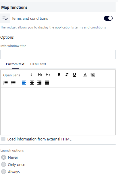
Figure 114 Application Rulebook Configuration
As with Displaying information, the user fills in the Window title and Information content fields. The information content can be completed using a simplified editor or HTML. It is possible to load external HTML. The user selects the checkbox and then loads the URL address. Additionally, the user can specify the display method after launching the application: Never (only from the widget button in the application), Only once (for a given user session), Always.
External Application
The user selects the External application button ( ) and then activates the switch to configure the parameters available in the widget.
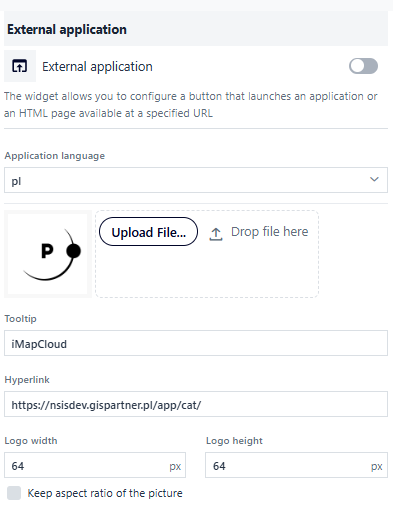
Figure 115 External Application Definition Tool
The configuration options include the logo of the button that launches the application, the button name (tooltip), the hyperlink, the width and height of the logo with the option of maintaining the proportions. .
Select other map applications
The user selects the Select other map applications button ( ), then activates the functions and configures them.
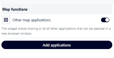
Figure 116 Launching the Tool for adding other Map Applications
The user selects the Add Application button. A window appears in which the user selects the application to be embedded within its application.
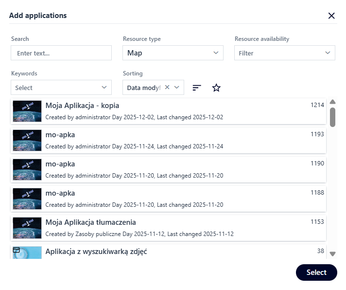
Figure 117 Selecting a Map Application
After launching the widget in the map window, the configured map applications will be displayed in the list.
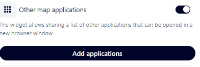
Figure 118 Tool Window
Zoom
The user selects the Zoom button ( ), then activates and configures the function. The following options can be enabled using the switch:
Show scale level
Default view
Previous/next view
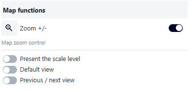
Figure 119 Launching the Zoom Tool
Graduation
The user selects the Graduation button ( ) and then activates the function. The user can also define the graduation style.
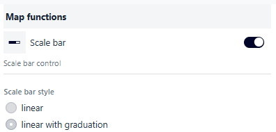
Figure 120 Launching the Graduation Tool
Scale
The user selects the Scale button ( ) and then activates the function. Optionally, users of the application can change the scale.
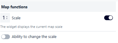
Figure 121 Launching the Scale Tool
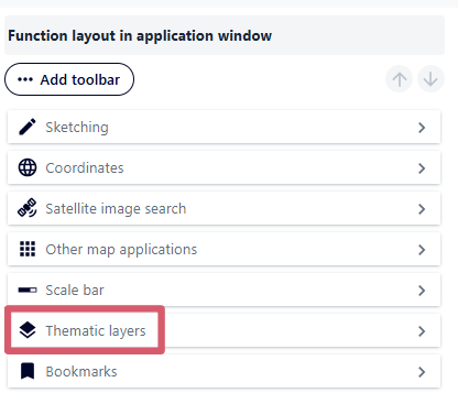
Thematic layers
The user selects the Thematic layers button ( ) and then activates the function. Additionally, the user can enable the display of full coverage for all layers by selecting the checkbox.
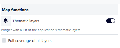
Figure 122 Launching the Thematic Layers Tool
After opening the tool in the map window, the user can enable/disable the visibility of individual layers previously defined in the User data tab.
Bookmarks
The user selects the Bookmarks button ( ), then activates the function and configures it. The user activates the switches for the channels through which the bookmarks will be shared (Facebook, Twitter, email, QR code). If no option is selected, the user of the application can copy the address to the application.
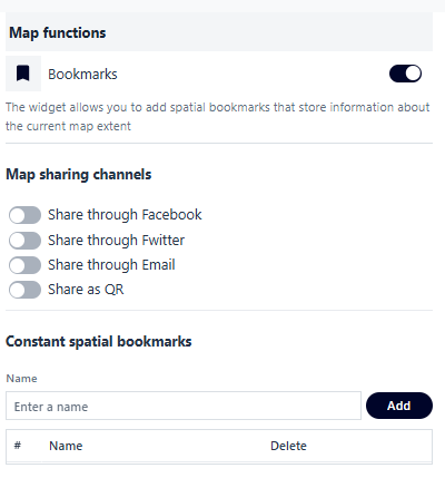
Figure 123 Launching the Bookmarks tool
The user can save permanent spatial bookmarks by entering the name of the bookmark in the Name field, zooming in on the selected location in the map window, and selecting the Add button. A bookmark created in this way is saved in the widget as a predefined bookmark.
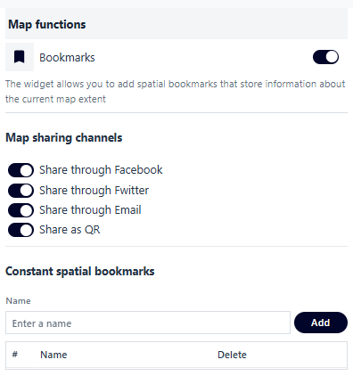
Figure 124 Configuring the Tool
After opening the tool in the map window, the user can save bookmarks using the add button. The name of the bookmark can be edited by entering edit mode (pencil icon ( )). The user can also share a link to the bookmark using the button (
 ).
).
Share the link to the map
The user launches the tool ( ) by activating the switch in the same way as other widgets.
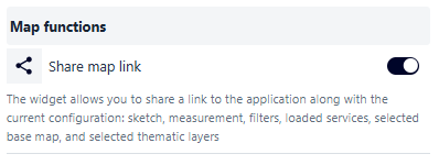
Figure 125 Launching the Tool to share a link to the Map Application
Google Analytics
Activating the Google Analytics function ( ) allows user to track the created application in Google Analytics. The user selects the Google Analytics button, activates the switch, and enters the ID that will enable tracking of the application’s activity.
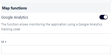
Figure 126 Launching Google Analytics
Language
The language changer allows the user to change the application’s language if one has been configured. Launch the tool by toggling a switch.
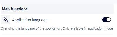
Figure 127 Launching the Map Application Language Change Tool
4. Layout and appearance
The Layout and appearance tab ( ) allows the user to define the position and opening method of widgets in the application and to configure the application logo and name.
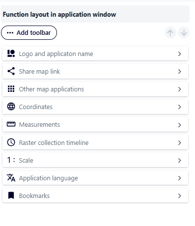
Figure 128 Function Layout Configuration Tool Panel
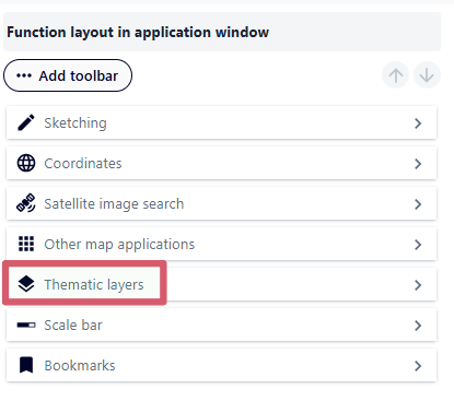
Layout of functions in the application window
In Function Layout (), the user can change the order of functions using the drag-and-drop method or using the arrows after selecting the tool in the list.
|
|
Figure 129 Configuring the Function Layout
Depending on the type of function, the user can also configure using the side arrow ( ):
):
Button position on the map (top left corner, top right corner, bottom left corner, bottom right corner, center left, center right, center top, center bottom),
Whether the widget should be launched at startup of the application,
Opening type:
Window, then: - display in a modal window, - window position (next to the button or centered in the application window), - window width and height in [%] or [px],
Drawer, then: - drawer position (on the left, right, or bottom of the application), - ability to nest other functions in the drawer,
Subpage, then: - transition button text.
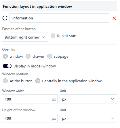
Figure 130 Configuration using the Map Information Definition Tool as an example
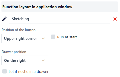
Figure 131 Configuration using the Sketch Tool as an example
The button ( ) allows you to return to the list of functions.
Add a toolbar
The button ( ) allows the user to create toolbars that group selected widgets. After pressing the button, the user can group selected functions in the bar using the “drag and drop” method or using the arrows after selecting the tool from the list.
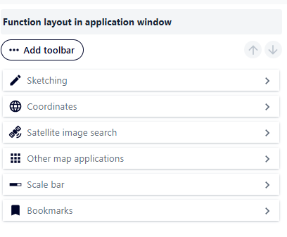
Figure 132 Adding a Toolbar
Additionally, the bar has its own properties when you click on the button (). These are, in order: button position, expand on startup option, expansion direction (vertical or horizontal).
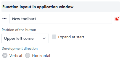
Figure 133 Toolbar Configuration
The bar with selected widgets can be ungrouped using the button ( ). After selecting this button, a warning message will appear.
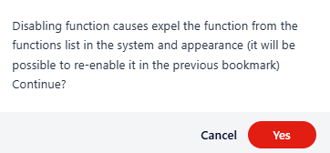
Figure 134 Removing the Toolbar
Application name and logo
The user can define the logo and graphic parameters for its display in the application. The user selects the Logo and application name button ( ).
).
By clicking on the switch icon, the user can disable the visibility of the logo. The available tools for the logo allow you to: - add your own image by adding a graphic file, - configure a hyperlink (clicking on the logo will redirect you to the specified page), - change the color and opacity of the background, - specify the dimensions of the logo (width and height with the option to maintain the image proportions).
By clicking on the switch icon, the user can disable the visibility of the name. The available tools for the name allow you to: - specify the application title by entering the selected text in the edit field, - change the color, opacity, size, and alignment of the text, - change the background color and opacity, - specify the size of the text field.
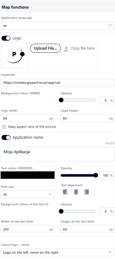
Figure 135 Application Name and Logo Configuration
The last configuration element is selecting the layout of the logo and application name from the list (logo on the left, name on the right / logo on the right, name on the left / logo at the top, name at the bottom / logo at the bottom, name at the top).
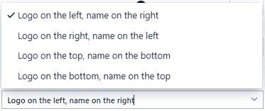
Figure 136 Logo Positioning
Properties
In the Properties tab ( ), the user sets:
application start range – after selecting the map range in the application preview, the user selects the button (
 )
)application scale range – using scales from the list, by entering the minimum and maximum scale, using sliders,
time after which an error message will be displayed when accessing services [s]
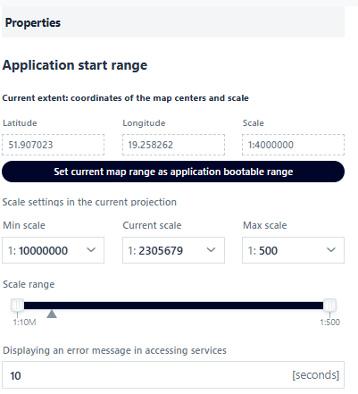
Figure 137 Starting Range and Scale Configuration
6. Save
In the last tab, Save ( ), the user saves, closes, or launches the map application.
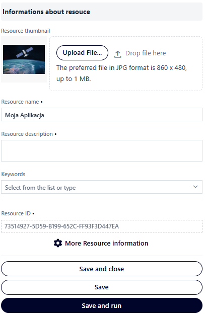
Figure 138 Setting the Final Parameters of the Map Application
The user fills in the basic metadata for the map application, such as: Resource thumbnail, Name, Description, and optionally selects from the list of Keywords.
When you select the More information about the resource button, additional information is displayed, which is filled in by default.
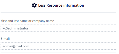
Figure 139 Selected Resource Information
After filling in all the required information, the user selects the Save and Close button, Save, or Save and Run. In the first case, the application is saved and Resource Manager is launched, while in the second case, the application is saved and the user remains in Map Application Studio. In the third case, the application is saved and launched in a new browser window.